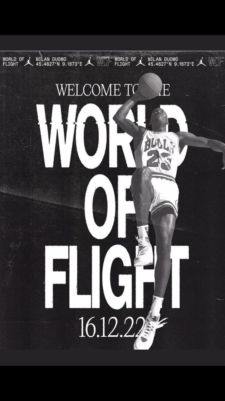
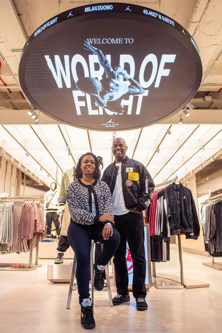
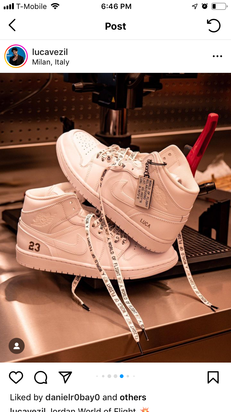
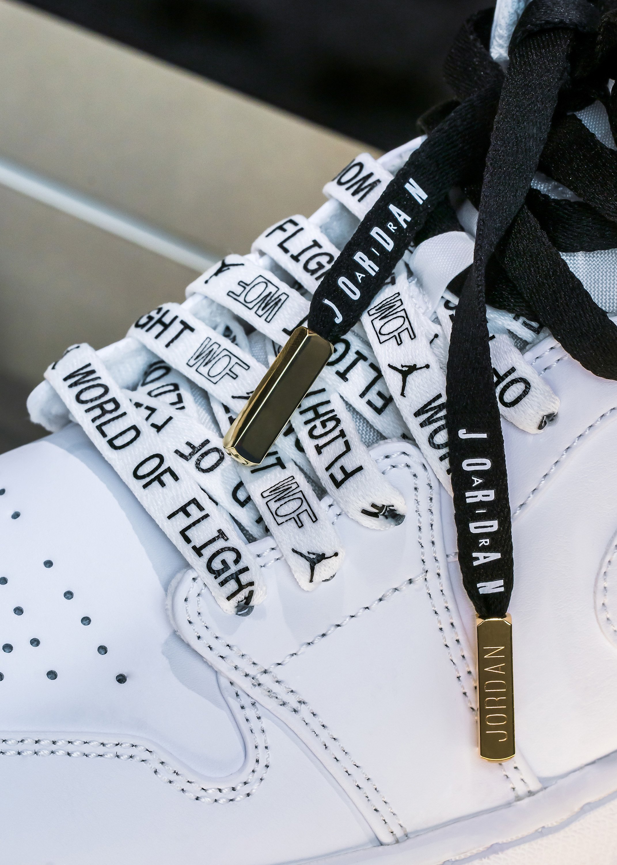
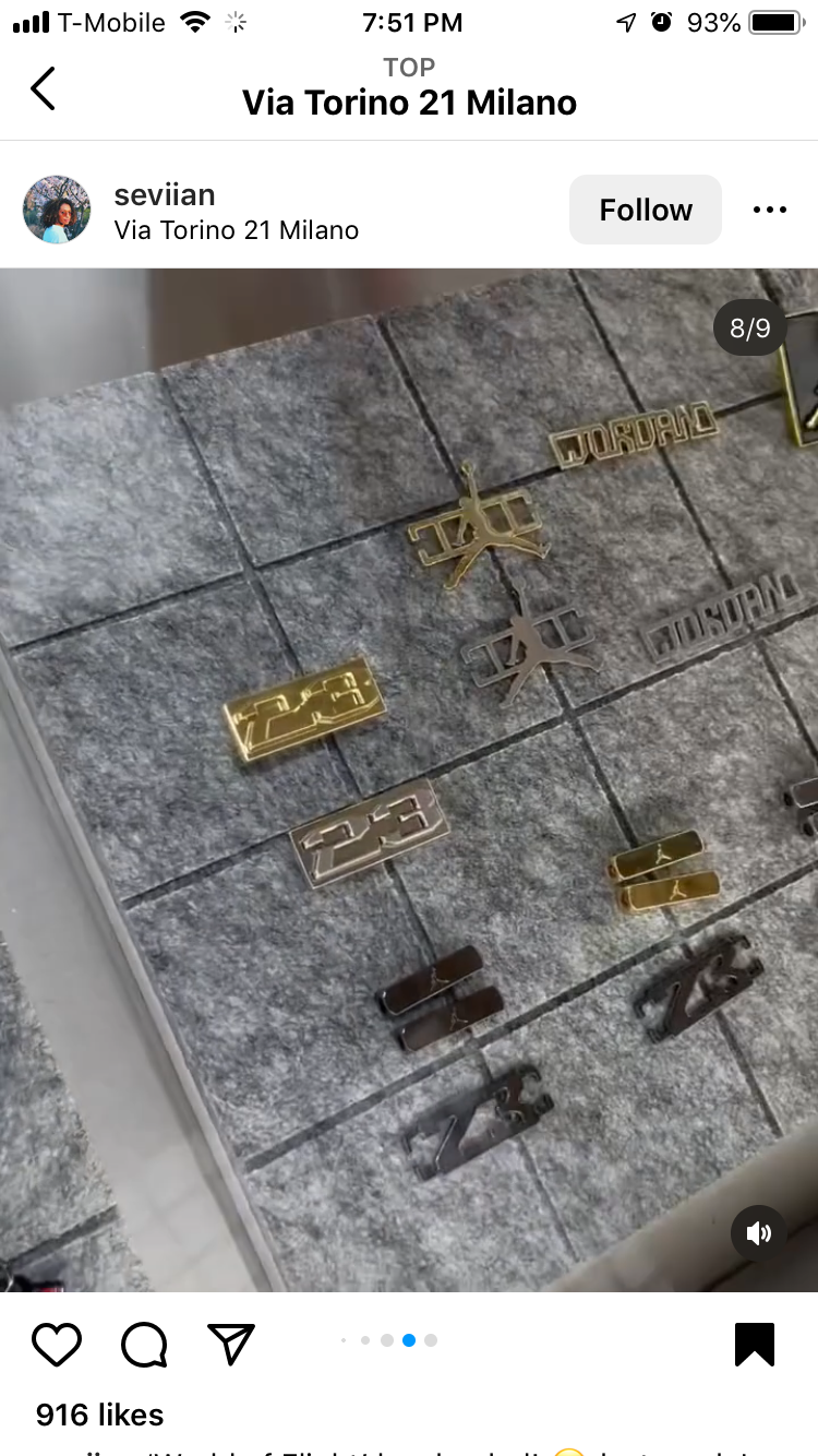
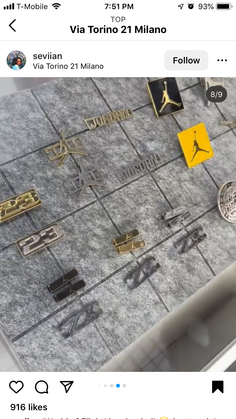
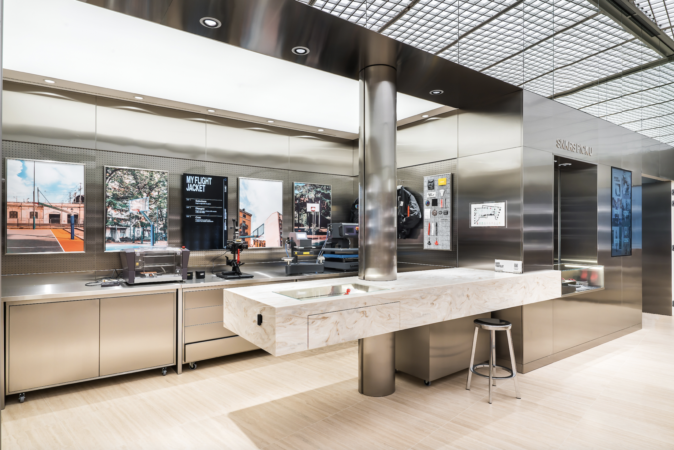
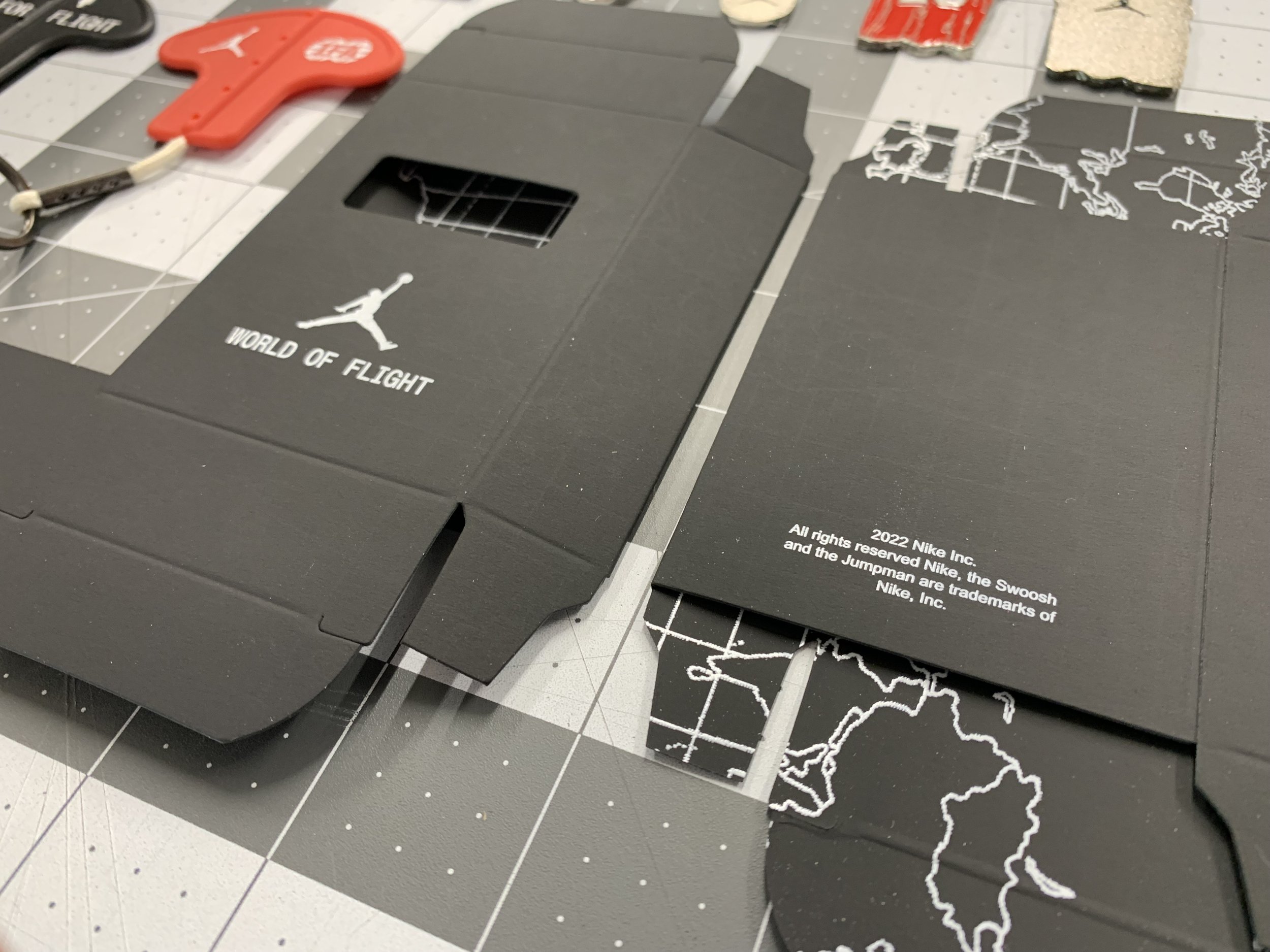
While working at Avery Dennison, our group was contacted by the Jordan Team at Nike to collaborate with their team to provide unique customization items at an elevated level for their new storefronts — World Of Flight.
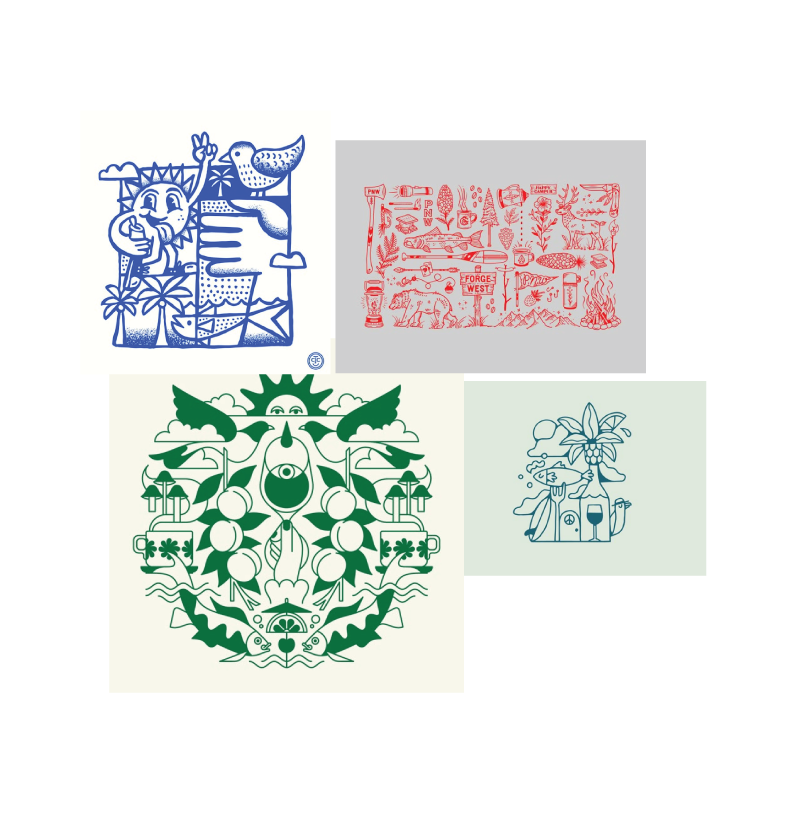
I was tasked with the project of designing Portland-themed patches for the Functional Fabric Fair. I started designing for the 2024 event and while those designs stalled, a few were revived for 2025 and were created.
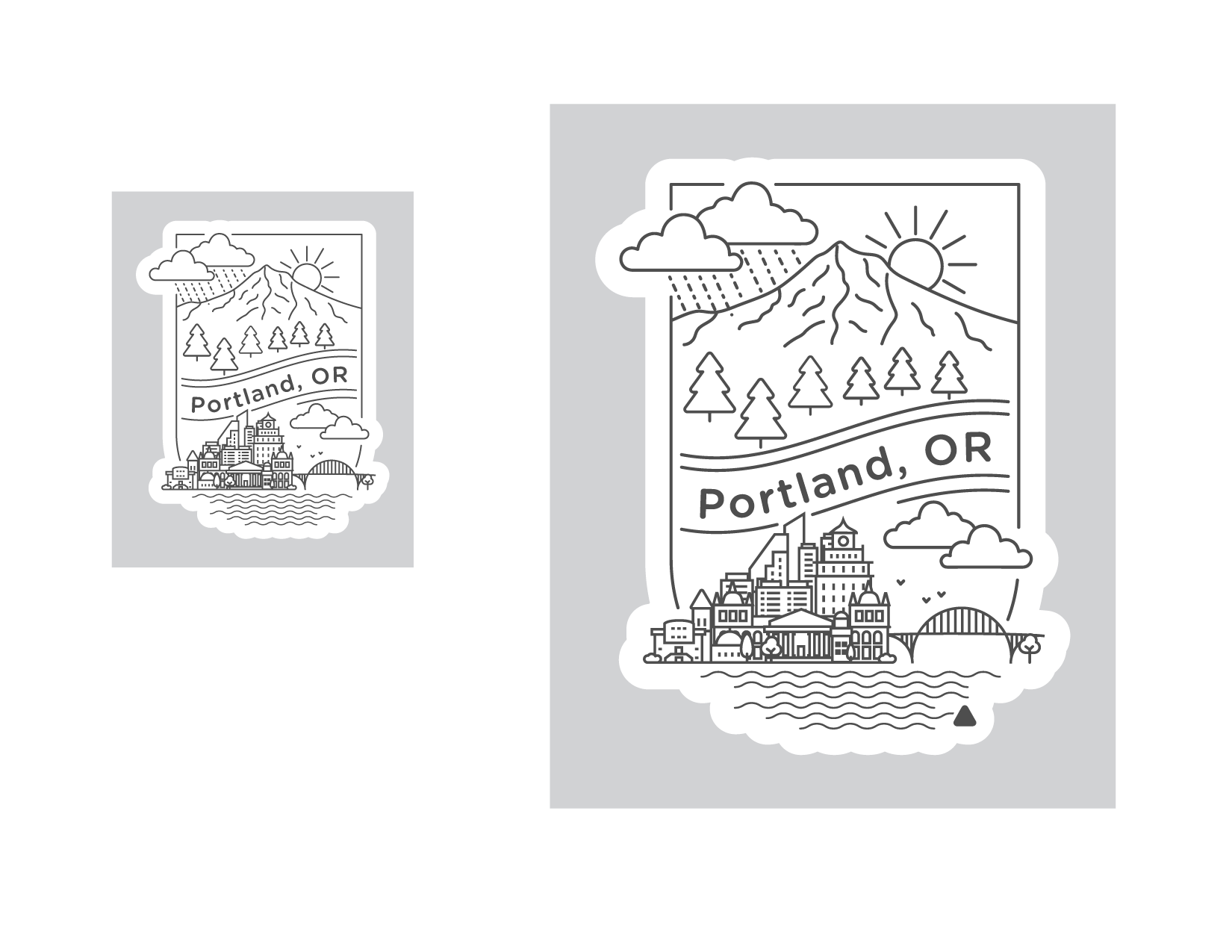
A mood board for my first design. A clean aesthetic with just linework but with lots of detail.
The final design, with and without the Avery Dennison triangle. I loved how this one came out—with just a bit of everything Portland including the bridge, the skyline, Mt Hood, and the fickle weather!
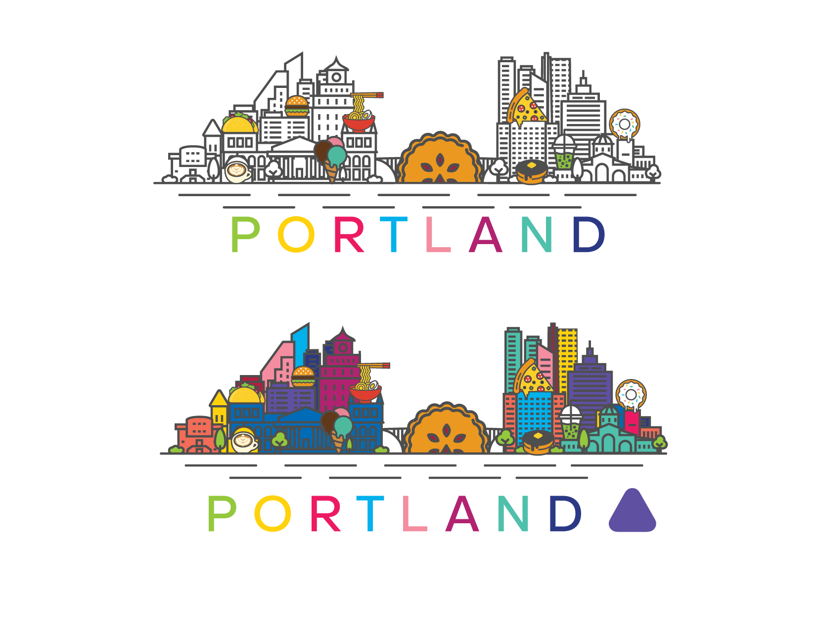
Expanding on the previous design but with an iconic Portland food twist, I included foods into the skyline, adding more color as an option.
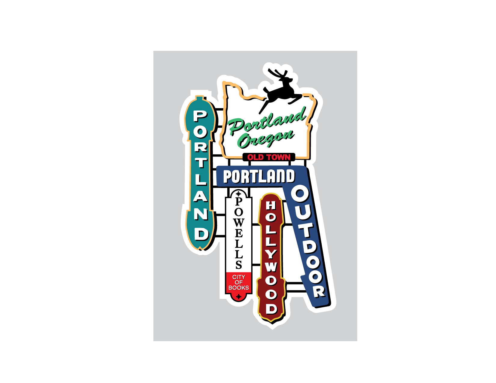
I liked the idea for this more than the final execution. I think, if I were to revisit this design, I’d simplify it to one of the signs, and perhaps add more detail. I believe that would execute better as a woven patch while this would work well as a Heat Transfer.
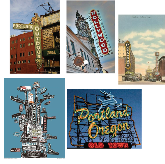
Portland is well known for its iconic signage, from the Portland Oregon deer to the vintage signs on its buildings. I wanted to pay homage to that with this design.
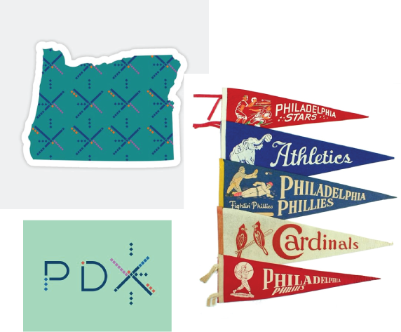
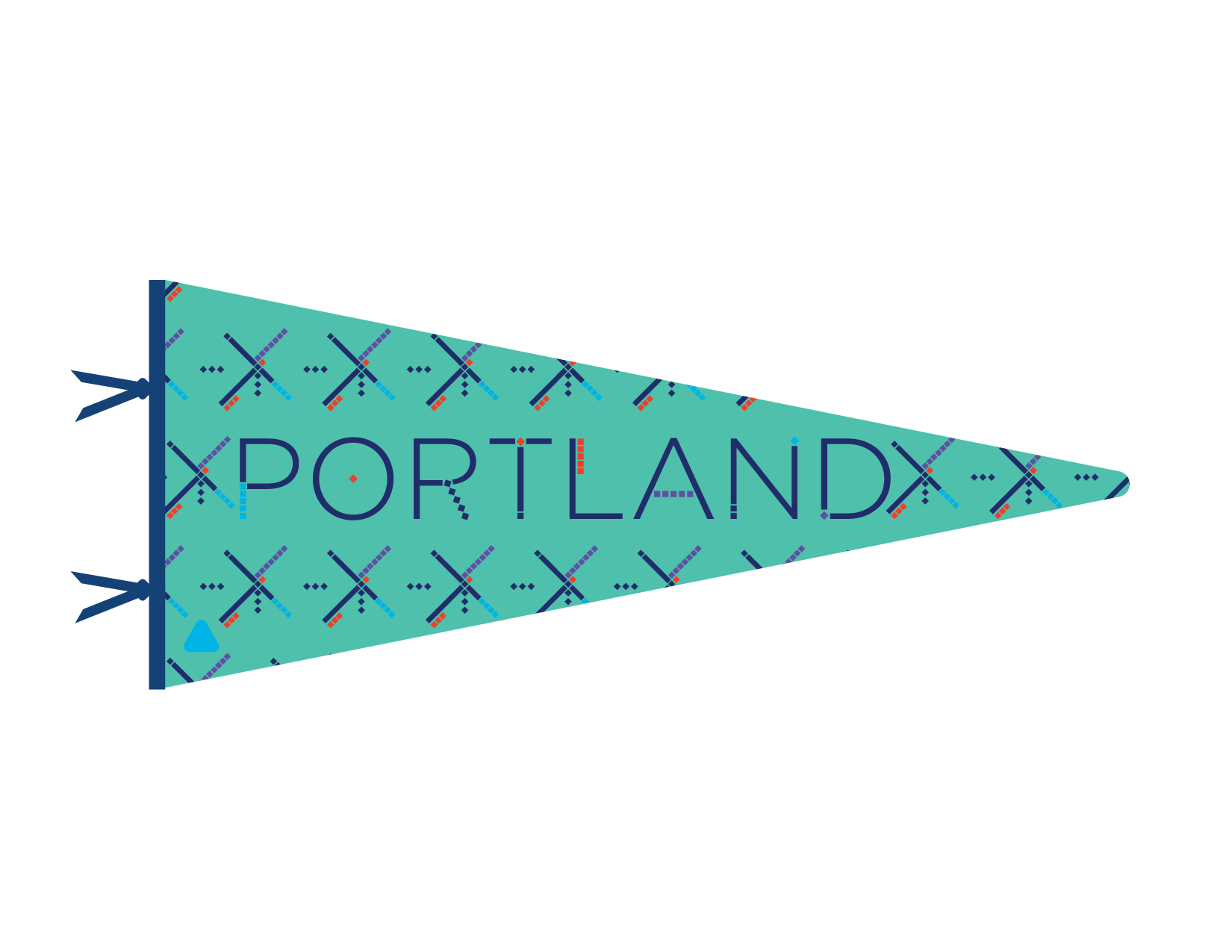
It wouldn’t be Portland design if there wasn’t an homage to the classic carpet design of the PDX airport. I chose to combine both that design and a vintage pennant.
A fun and clean design though I was worried about this execution at smaller sizes and in Woven Soft Seal, I was pleased with its result.
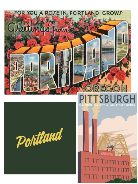
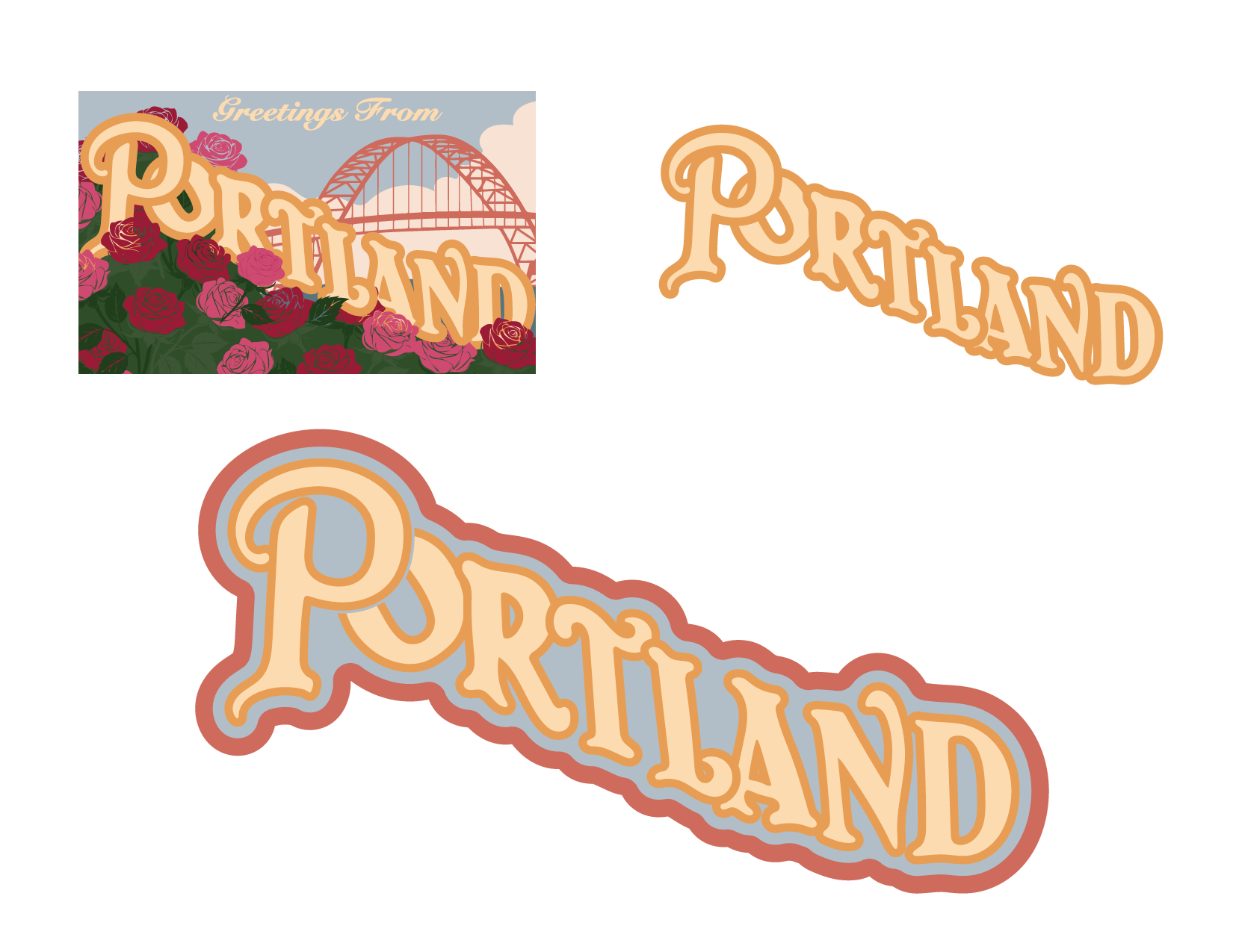
An update to the classic vintage ‘Greetings from…’ Postcards with a more modern aesthetic. I created an update to this design for 2025 with just the beautiful colors and custom type.
The final design of 2024 and the updated design for 2025
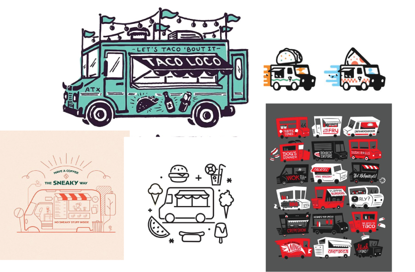
Portland has an excellent food scene, and one of its most special and unique contributions is its food truck scene. I wanted this design to reflect that.
A stylized and pop art aesthetic for this food truck design.
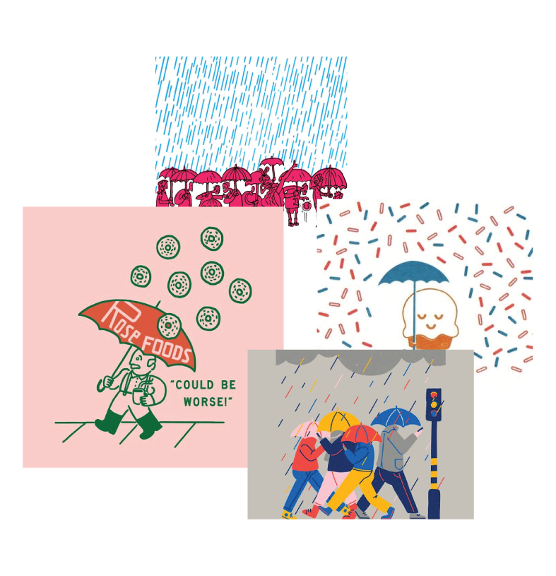
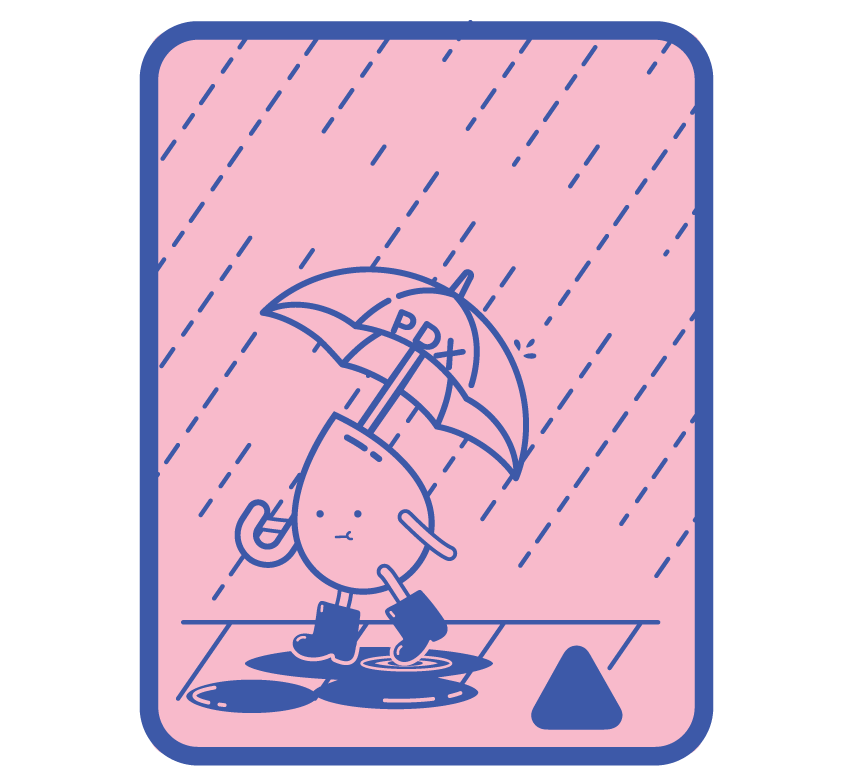
If someone knows anything about Portland, it’s about the weather and our rain. Without our rain, we can’t have our lush greenery.
Sometimes our rain gets so bad even our rain drops need a break from it. This was just a simplified character design of a little raindrop surviving the Portland weather.
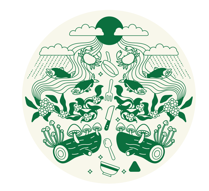
Drawing inspiration from these stylized images with lots of details and one color, I combined that with Portland and Oregon’s access to the natural bounty of the area including fish, berries, mushrooms, and seafood.
All that can be found in Oregon that can make its way to Portland restaurants and diner’s plates. Including some of my favorites—salmon, berries from the Willamette Valley, and Dungeness crab from the coast.
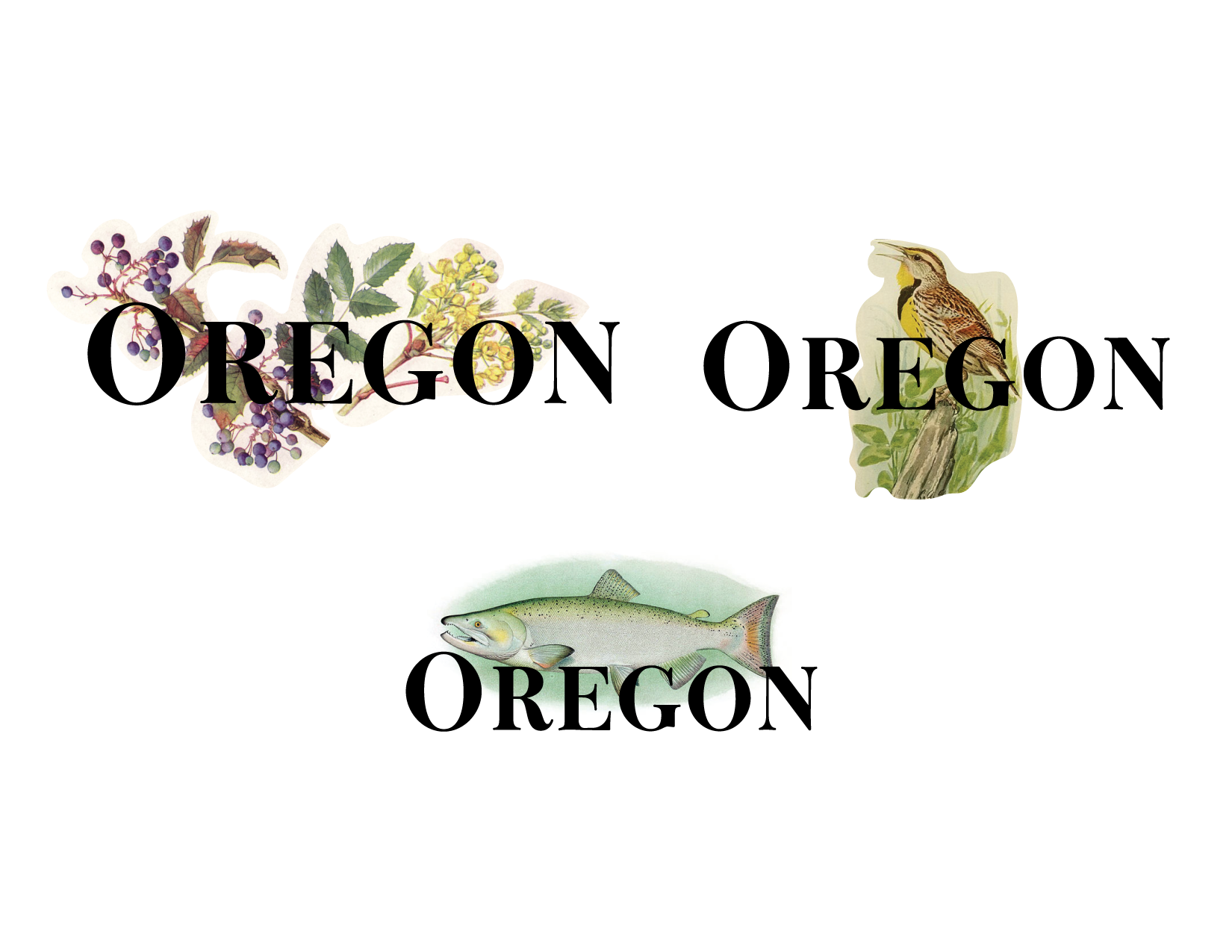
Some initial ideas combining a beautiful font with some vintage illustrations that are representative of the state of Oregon—state flower, bird, and fish. These never progressed further but I liked the idea but not quite right for a woven patch. These would have been perfect for the use of heat transfer that was dropped.
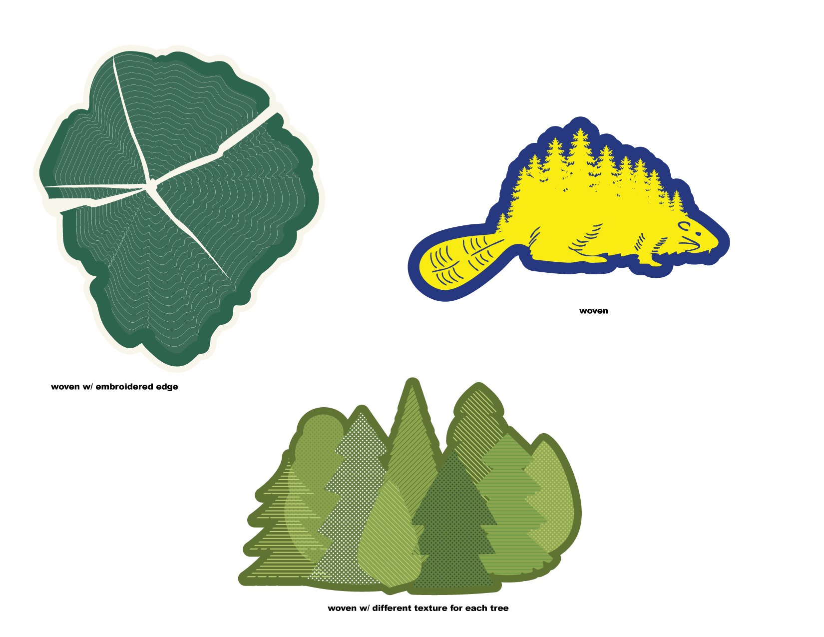
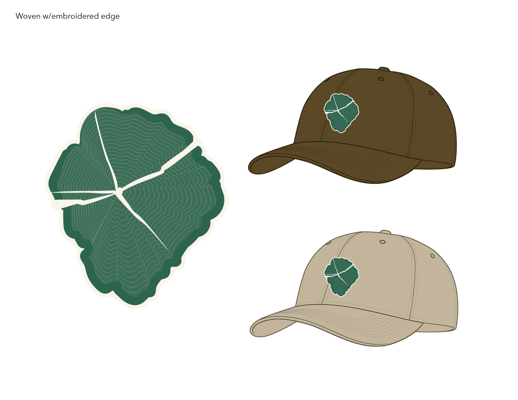
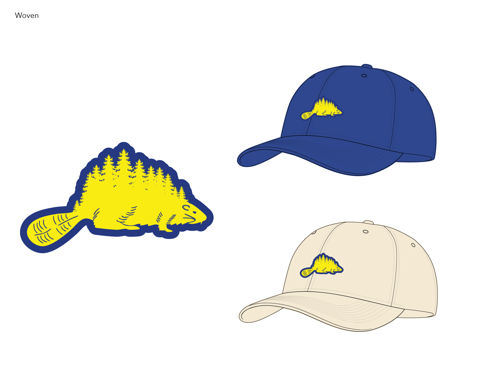
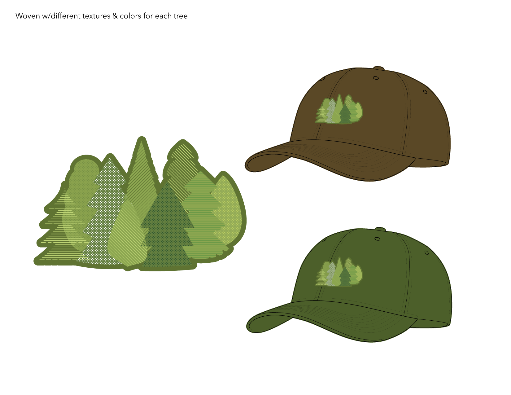
Some quick designs for 2025 including a cross-section of a tree stump (Portland is often referred to as Stump Town), the beaver from Oregon’s unique two-sided flag, and a texture play to highlight Oregon’s many different trees.
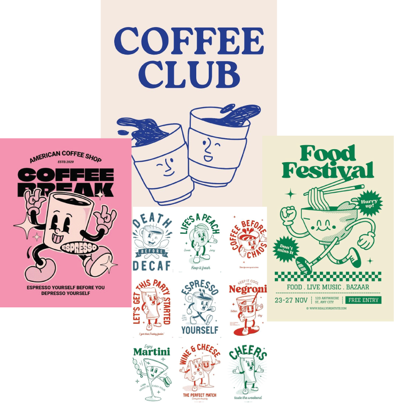
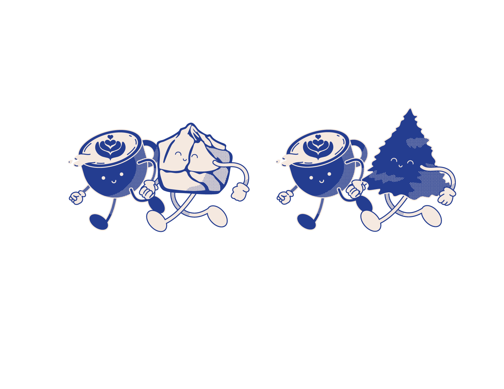
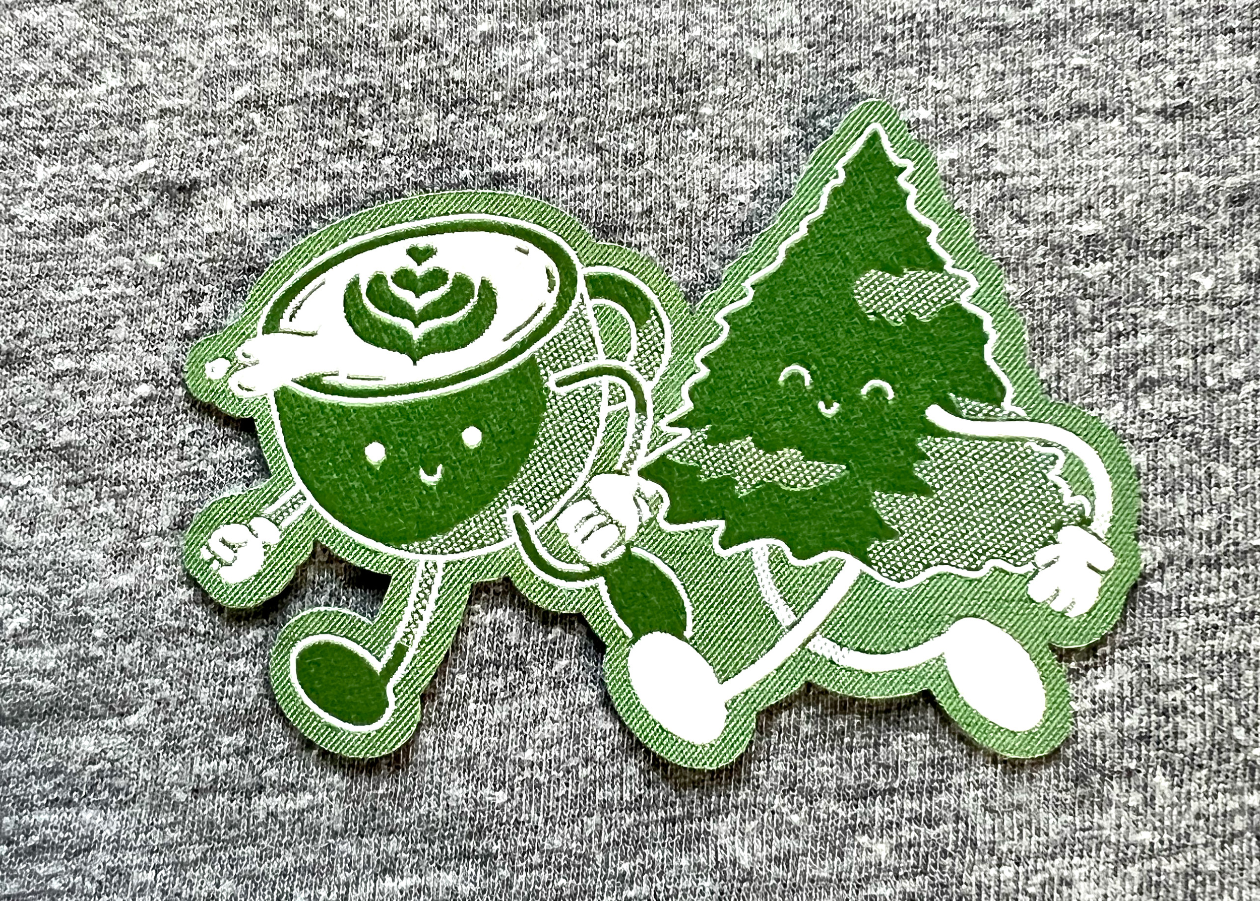
Portland loves its coffee and I wanted to show that with a cute coffee character in the style of old cartoons.
My first design included double coffees—classic drip and latte art espresso.
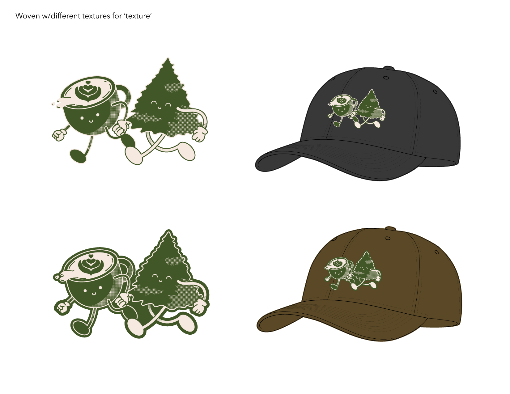
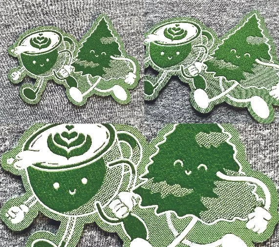
The update to this design for 2025 had me swapping out one coffee for another icon of Portland—a fir tree and a mountain.
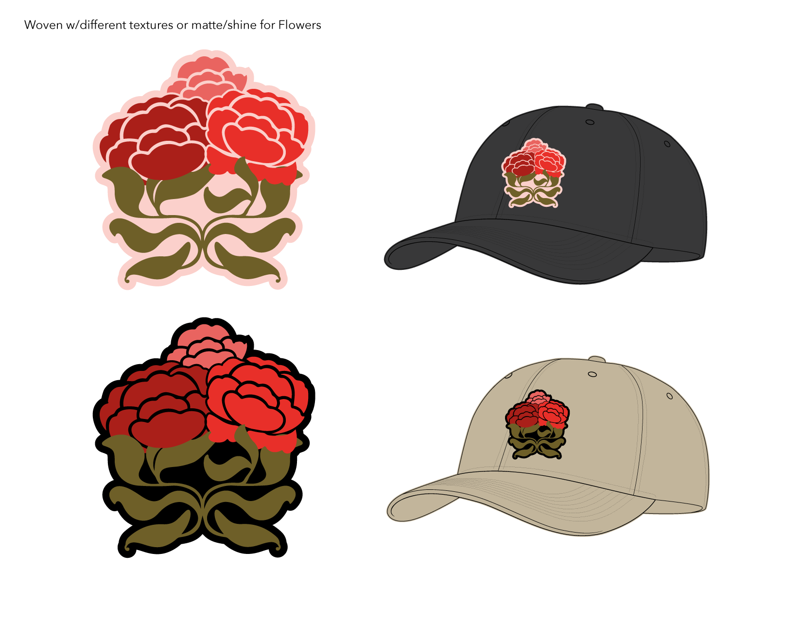
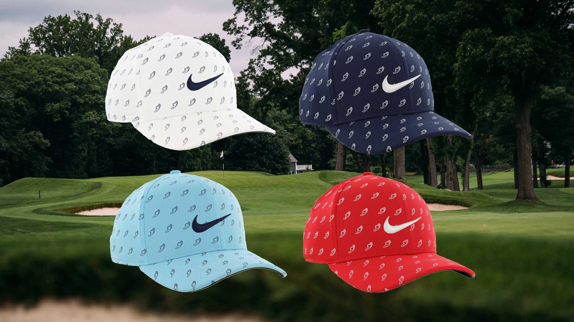
For 2025, the designs were intended only for use on hats, so I comped the designs with and without an outline and showed them on some baseball hat colorways.
I’m so pleased with how this patch finally came to life. The combination of shine and texture really highlighted this cute design even with only 2 colors.
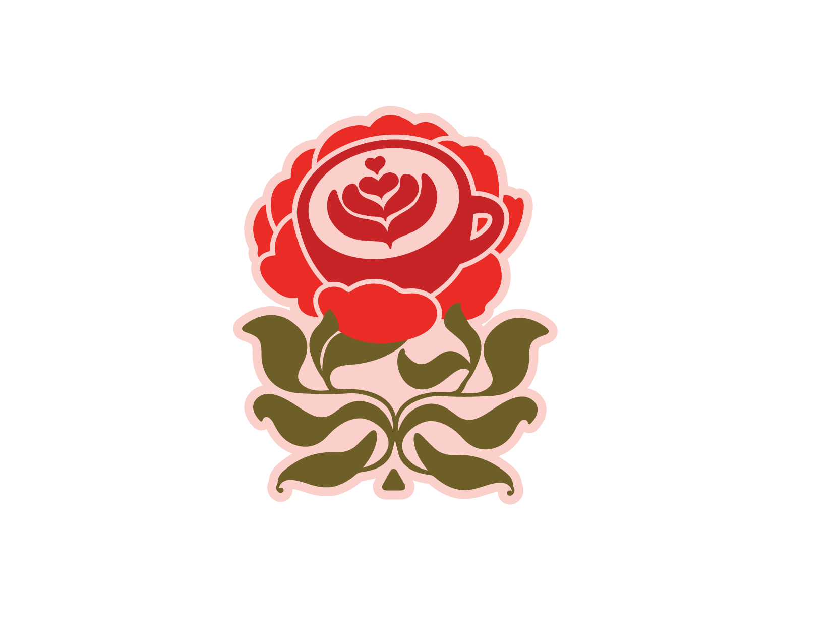
Portland is also referred to as the City of Roses and is home to the International Rose Test Garden so I wanted a patch that would reflect that.
Initially I had combined the rose imagery with a latte cup but updated for the 2025 FFF, I just added more roses in different colors. I also played with adding text, including Portland’s establishing year.
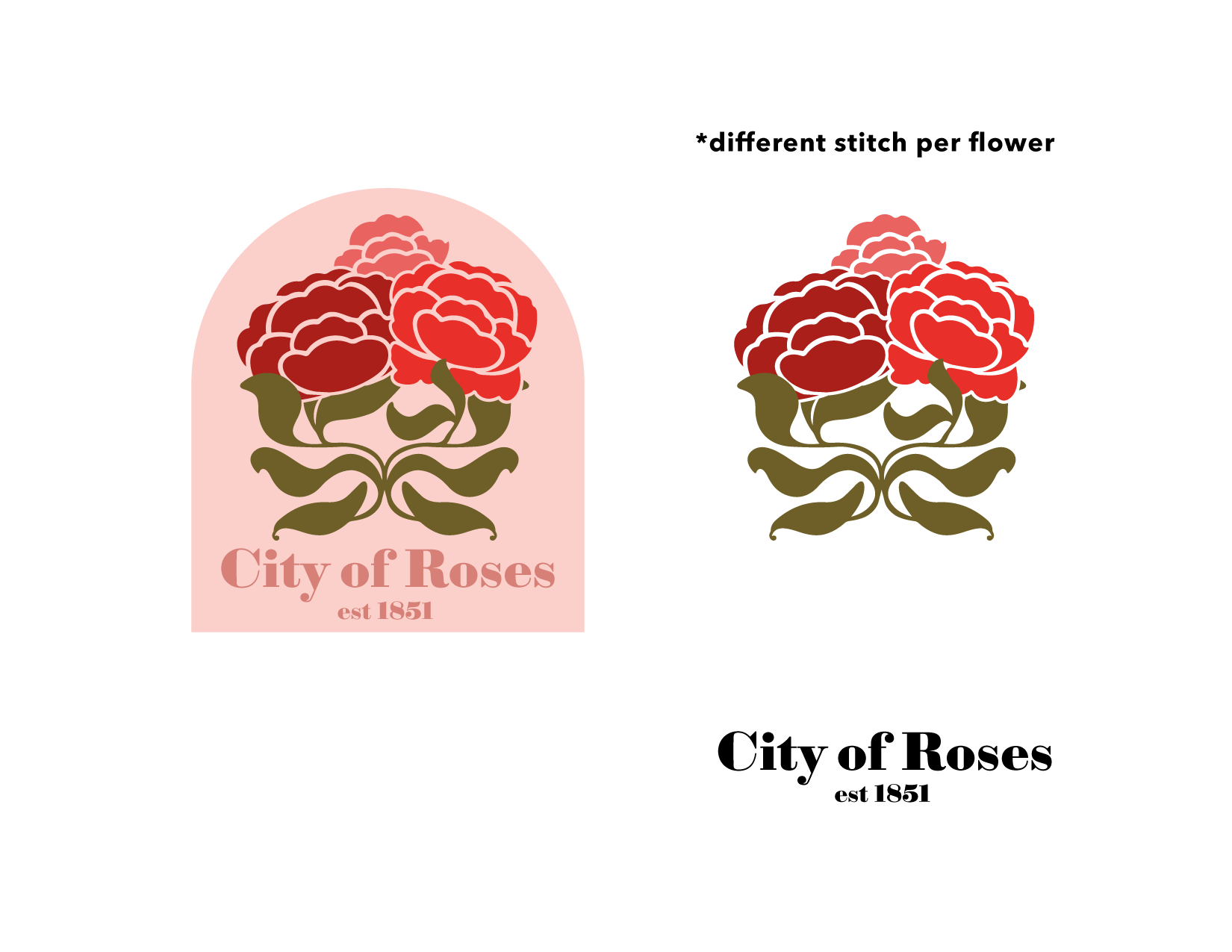
I played with two options for the final—a light and dark background, but decided the colors popped better on the black.
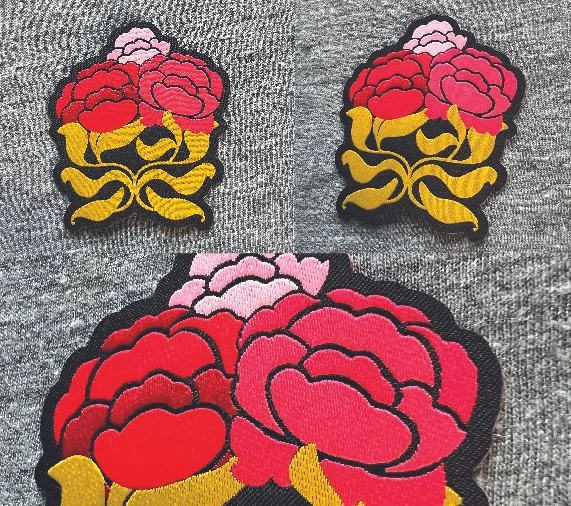
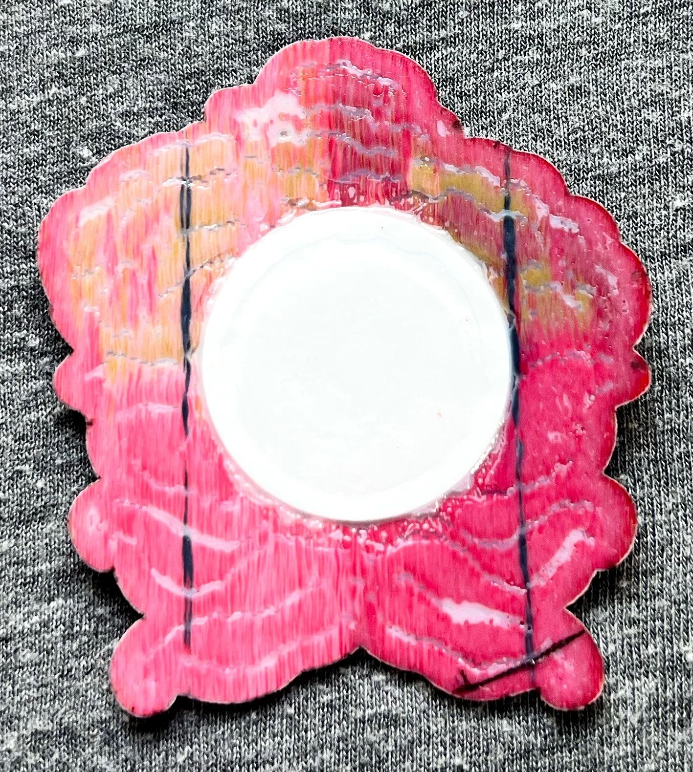
I loved the final design for this, including the matte/shine of the thread of the petals.
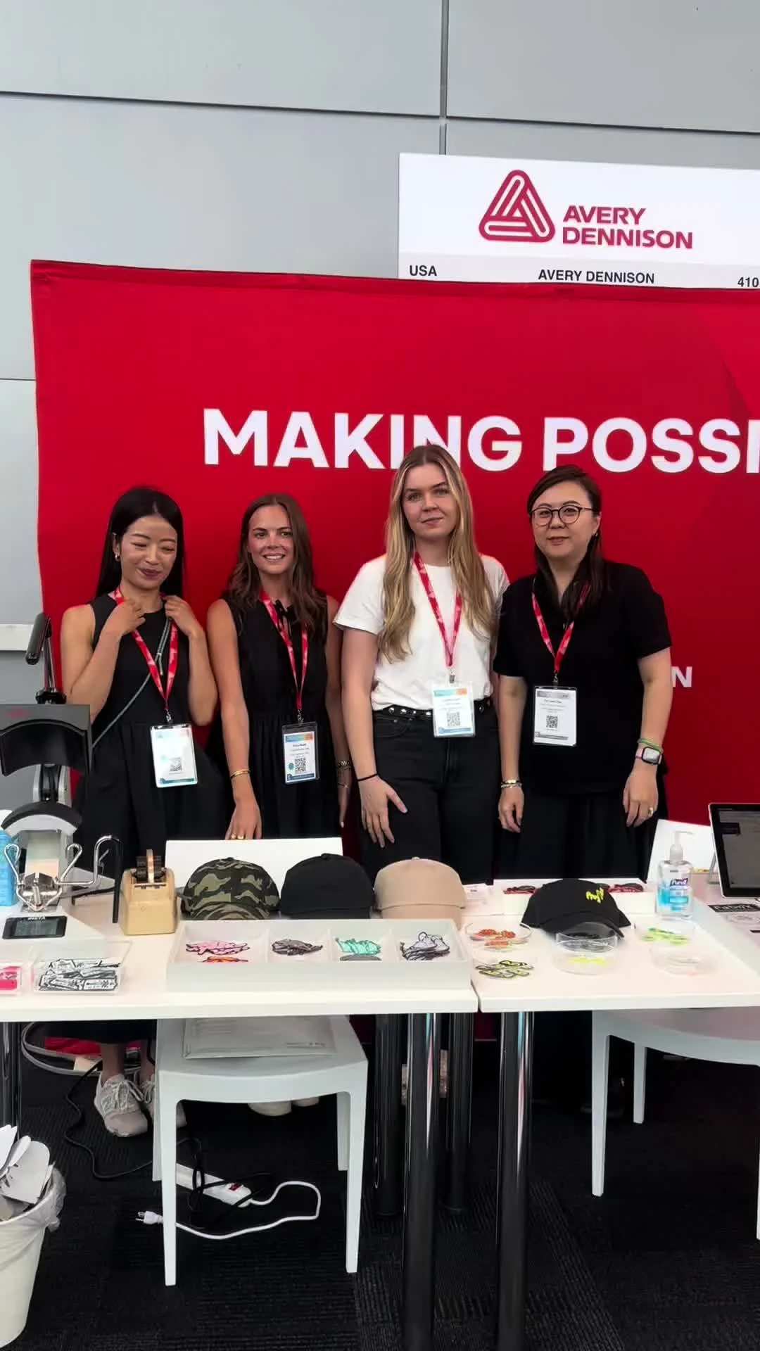
While this is at the Functional Fabric Fair in NYC, this booth setup was the same at Portland but with our Portland-themed patches. A good example of how these patches can be easily applied to a hat and be ready to go in just a few minutes.
This design was also perfect to implement a NFC (Near Field Communication) chip. This could be scanned with a smartphone at the event and would direct to the Avery Dennison website.
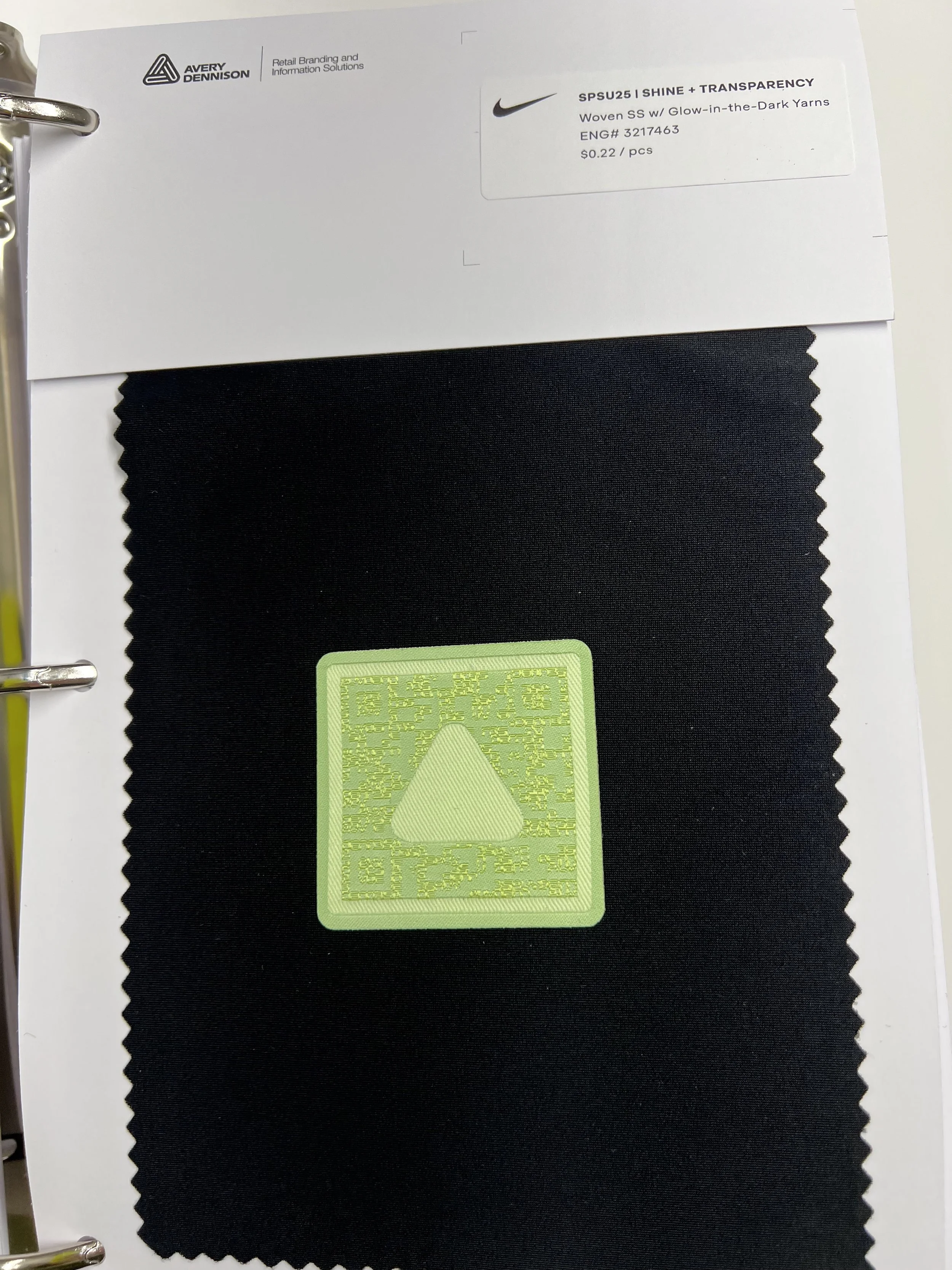
A bi-yearly project included producing trim kits to present at Nike's seasonal GLAM, Global Apparel Materials summits.
Trim Kits were initially created using the samples created by Avery Dennison’s Newness team. Based on the GLAM team’s seasonal direction, we chose samples that best fit their intent.
Shown here with their inspiration techniques.
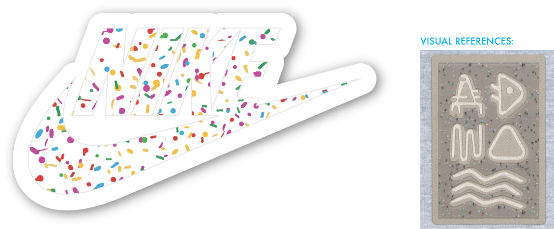
Heat Applied Tinted Circular Silicone with Glitter.
Woven Soft Seal base with Satin Stitch Embroidery and Clear Silicone Dome and Print.
Woven Soft Seal Base with Translucent Circular Silicone and Glitter
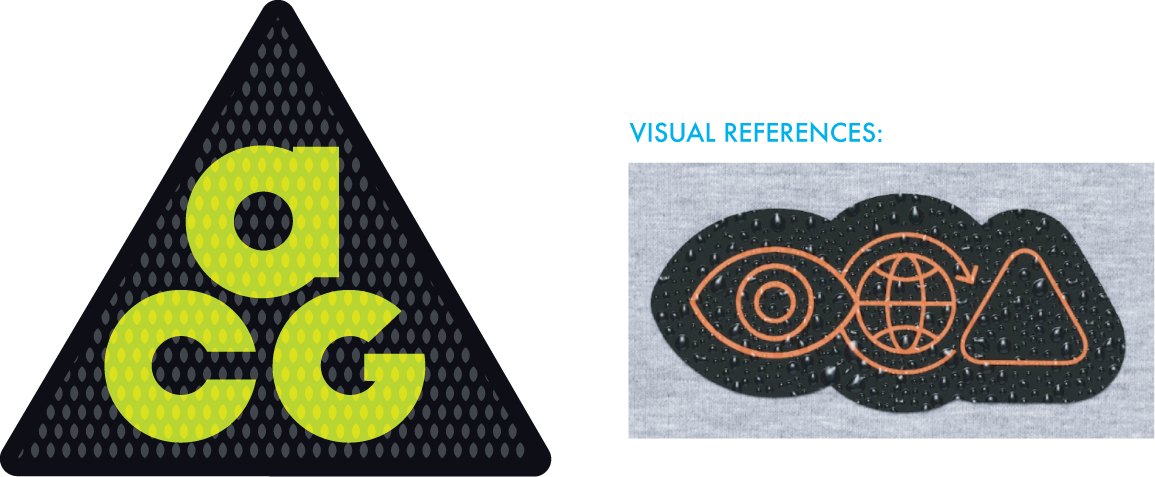
Printed Silicone with Water Drop Effect
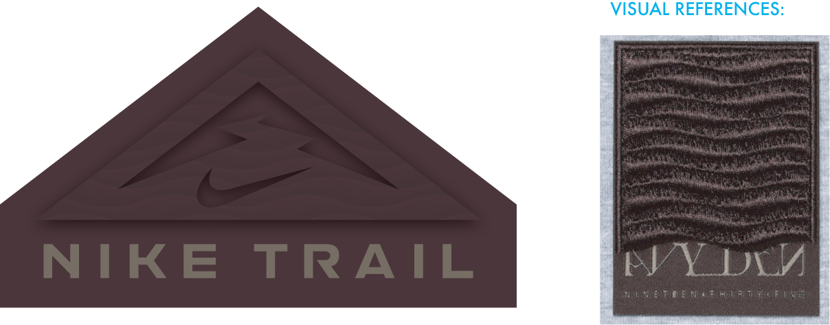
Woven Base with Wavy Embroidery
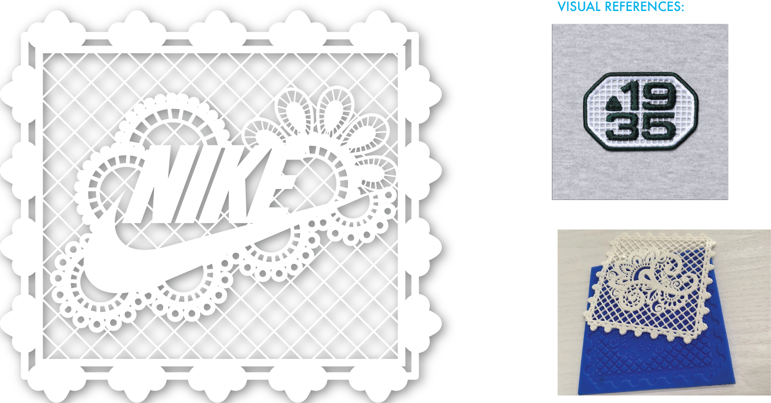
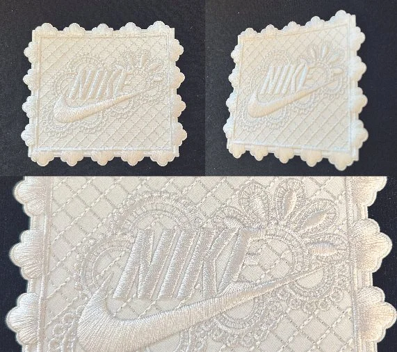
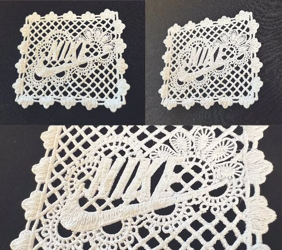
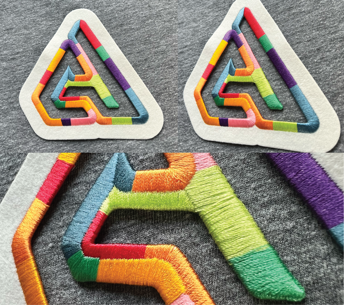
Embroidery with Net Effect. While a true lace effect was my intent, and Nike’s specific request, it was something not established as possibly by our factories. For this reason I created four options—my original intent, a silicone version, a woven soft seal version, and a woven soft seal with silicone option.
While not exactly my original vision, this sample came out beautifully. The white on white with the dimension and texture created by the embroidery resulted in a striking sample, if not exactly ‘lace’.
After a bit of back and forth and working with my Product Line manager, we received this perfect sample. The factory used a fairly new technique of embroidering onto a temporary backer that stabilized the intricate pattern and resulted in a true ‘faux’ lace patch. Because of the delicate design, this would have to be manually stitched down instead of heat application.
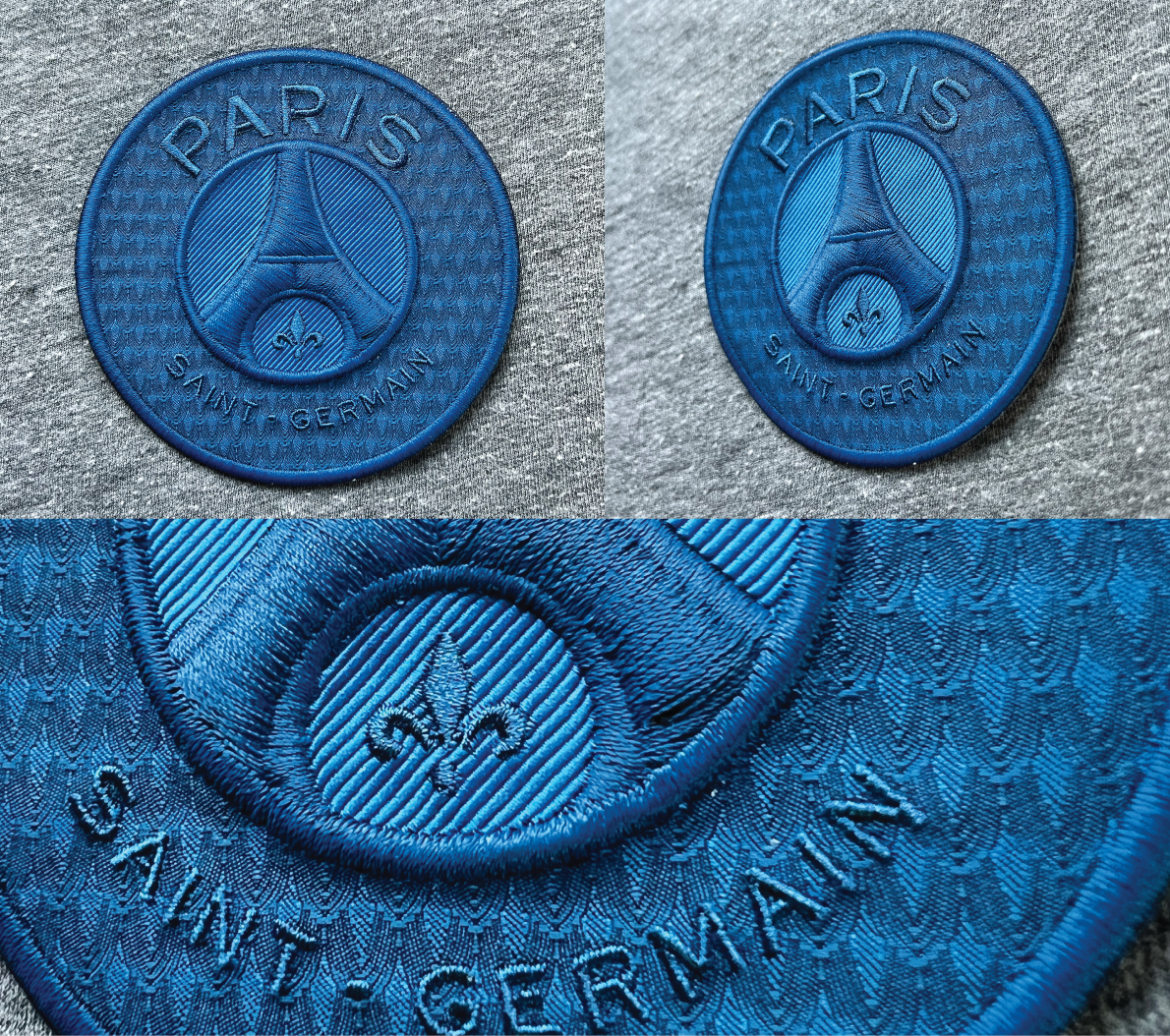
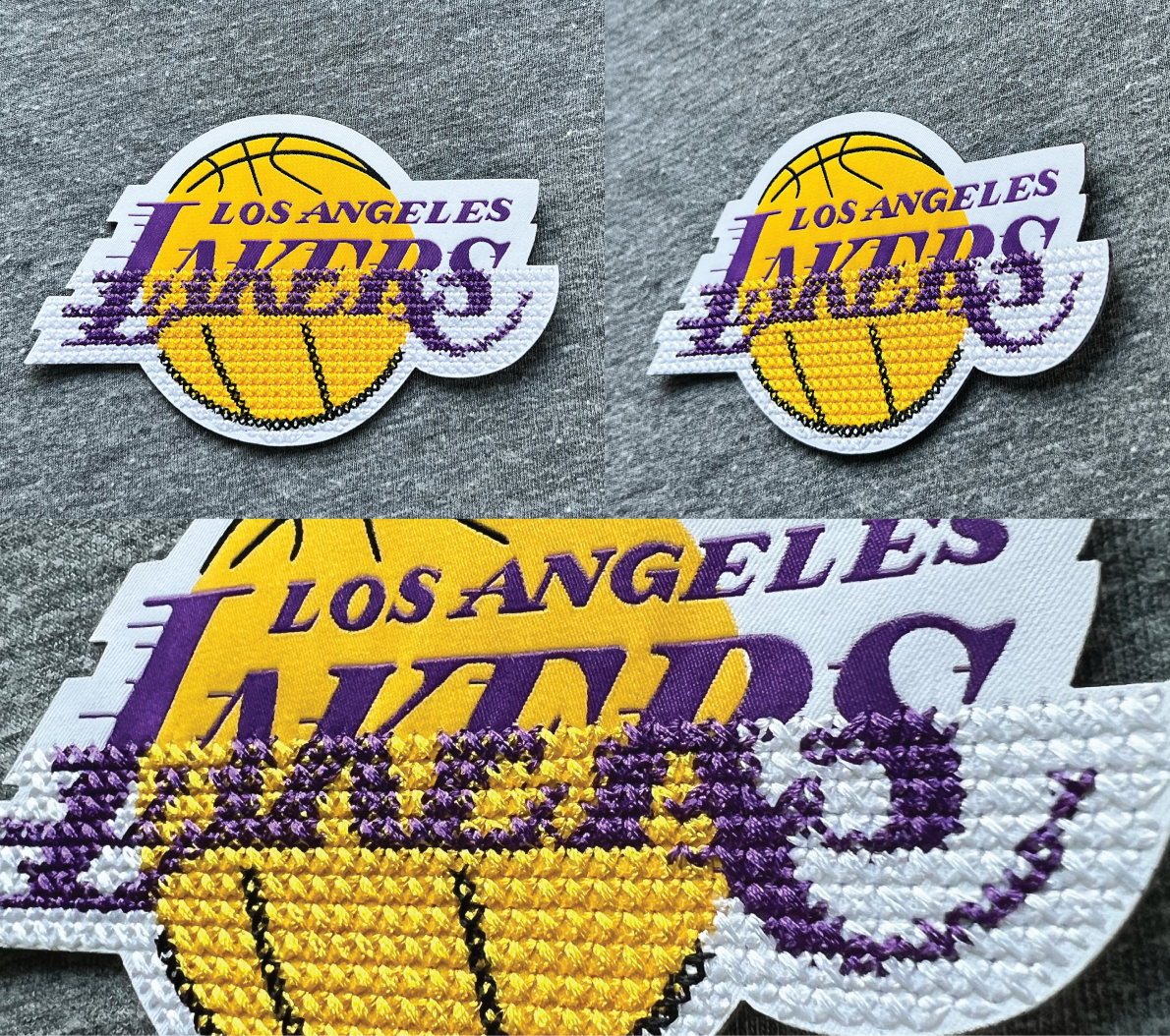
Continuing on the bespoke samples from SpSu27, our team at Avery created exclusively bespoke samples for the season of FaHo27. Using Nike’s design intent for the season as inspiration as well as our own market findings, I created these patches. Spanning a wide variety of our techniques, and combinations therein, this collection showed a bit of everything that Avery Dennison is capable of.
I was very pleased with how closely these samples came to imitating the original inspiration, despite being hand embroidered. If I were to continue with this project and technique, I would like to push how small the design could be and still achieve this crisp and clean embroidery.
The original inspiration image as well as the referenced internal sample for the embroidered technique.
A beautiful sample which could easily be translated into many logos or even include multiple colors. I prefer the cleanness of the single color however.
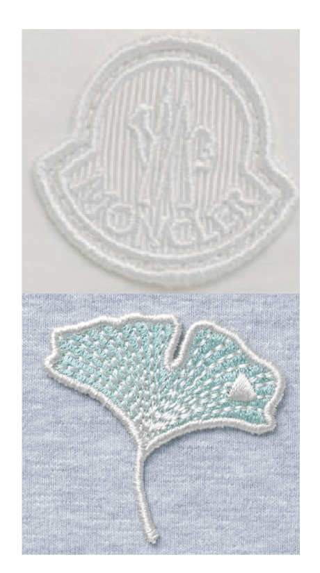
Inspiration from the market, the Moncler patch and a visually reference of a fully embroidered patch created by Avery Dennison’s Newness team.
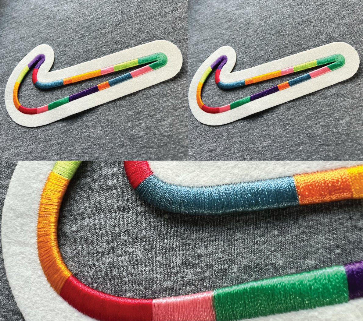
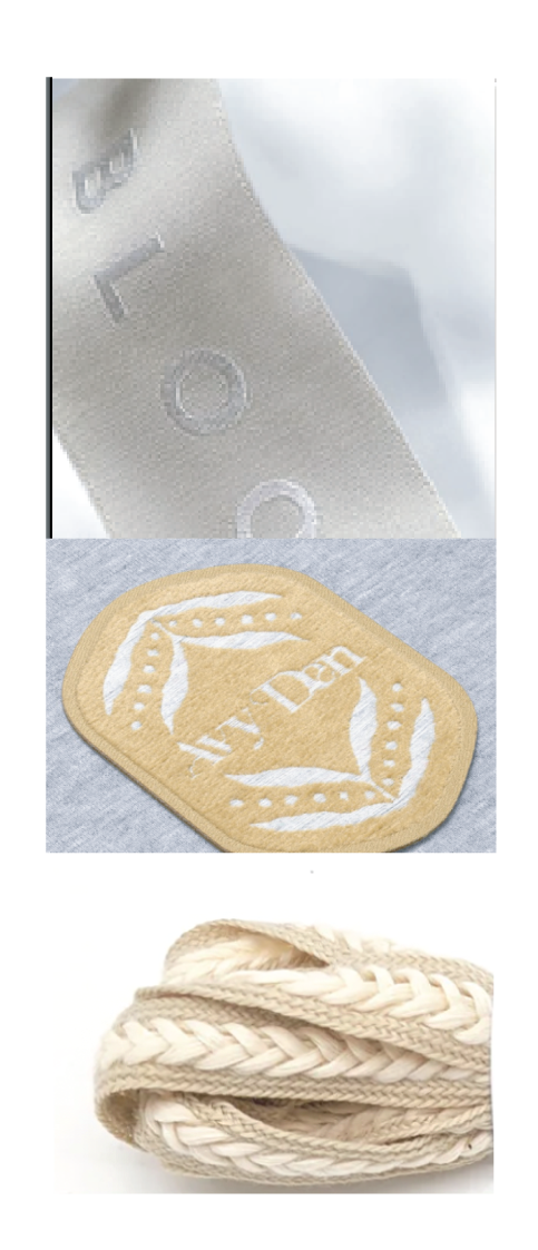
Inspiration for taping including soft textured fibers like chenille thread, tonal colors, and a braiding effect that we used on our our Jordan by You laces.
A really nice sample and my first ever tape. While two versions were created, this one I was far happier with.
A beautiful woven soft seal with a woven reflective pattern and a rainbow reflective film. While this likely doesn’t meet candle power standards for safety, these samples definitely meet the technical/outdoorsy effect I was hoping to achieve.
The bright rainbow reflective overshadows the reflective thread of the pattern behind it but creates a beautiful effect.
References from Avery Dennison’s Newness samples for both welded silicone and pattern woven reflective soft seal.
This was a small update to the previous design to add some dimension and interest by putting a layer of clear silicone behind the reflective film.
A unique if unusual effect of the film being applied to the silicone is that it changed the color of the rainbow reflective. It was not my intention, but I thought the final effect was a cool and fun surprise.
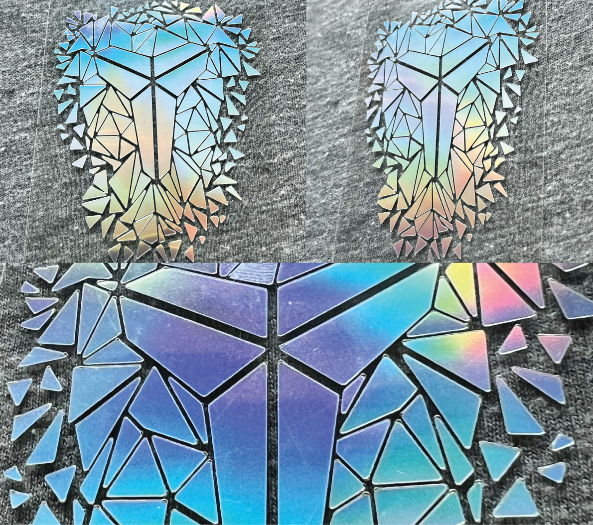
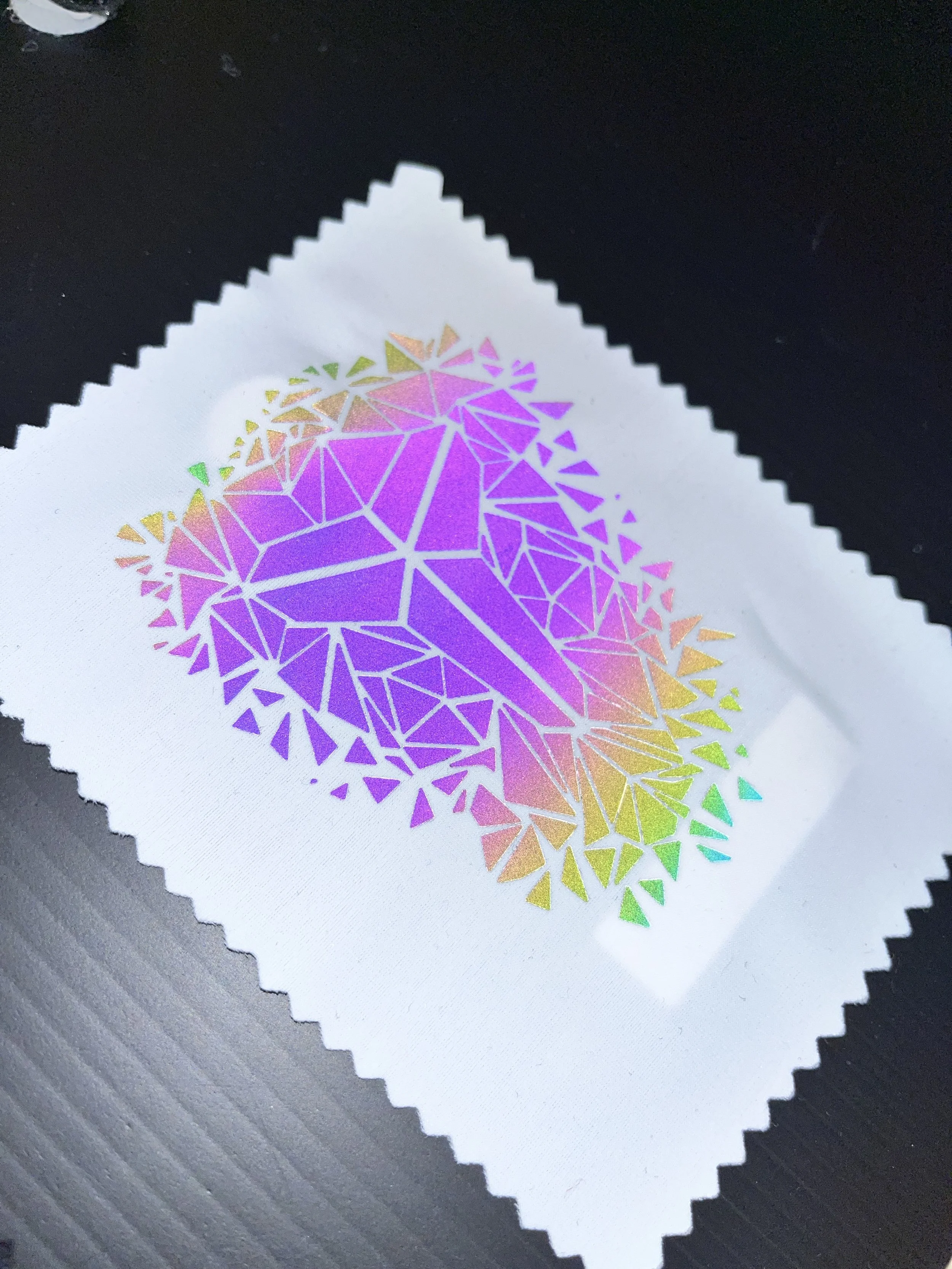
A holographic foil technique that was new to Avery Dennison at the time.
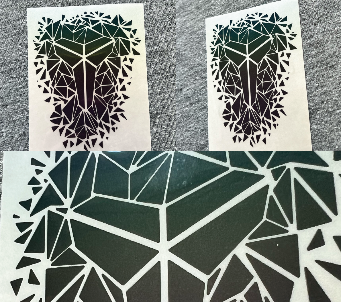
In order to truly highlight the detail and crisp edges that foil can achieve, I designed this ‘shattered glass’ effect for Kobe Bryant’s logo. The result was so effective that it was one of the most well-received samples at the GLAM summit, with all of the samples we had being taken with requests for even more.
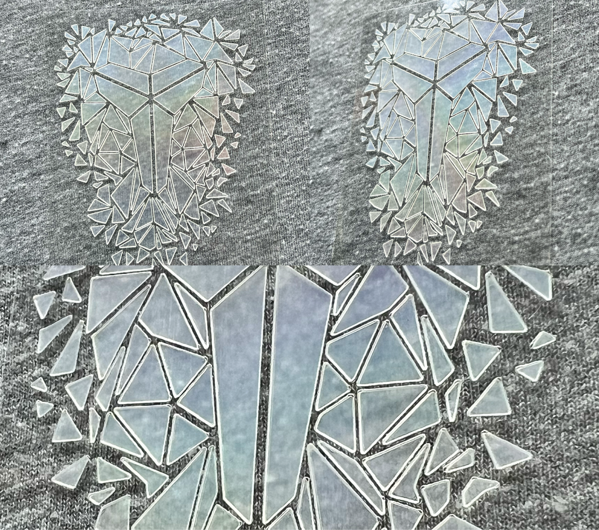
A more subtle effect than the silver holographic foil, this resulted in a more true ‘shattered glass’ effect that was my original intention.
A reflective foil reference from Avery Dennison’s Newness team.
While somewhat lackluster in its original form, this sample truly shines when flashed with a light.
This color and shine is hiding behind the dull and dark of the reflective film.
A woven soft seal with about as many techniques as I could fit into it, aimed for for a more elevated piece. It includes the woven soft seal base with another woven soft seal inner piece that also has a raised embroidered center piece. There are two different woven patterns, triple shuttle embroidery, and merrowed edge. I love how this piece came out.
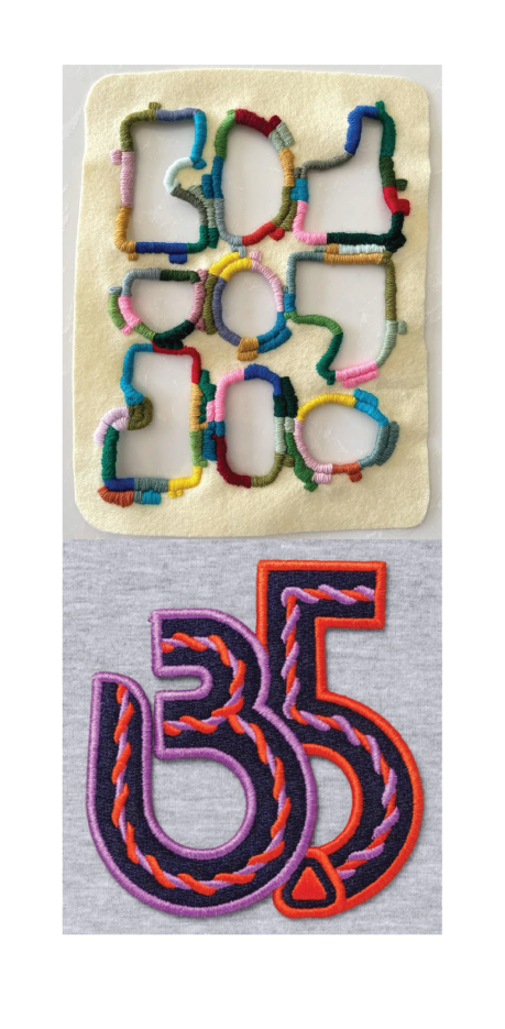
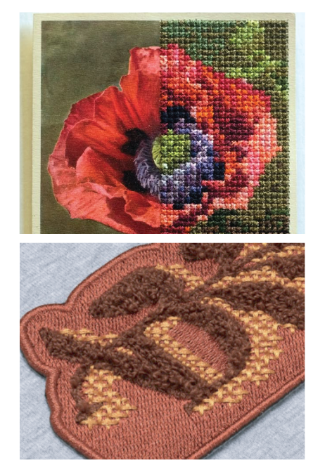
Inspiration of a painting with includes cross stitching and the cross stitching reference from a Avery Dennison’s Newness sample.
I thought a team logo would be a fun way to combine the more technical aspect of a sports team and the crafted style of cross stitching. I was really pleased with how this sample came out and would love to see this effect blown out across all NBA logos. If I were to revisit this style again, I would love to update the cross stitching with a more textured thread like chenille to up that ‘hand-crafted’ look.
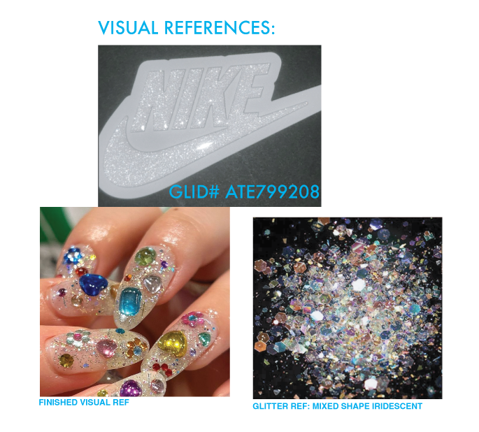
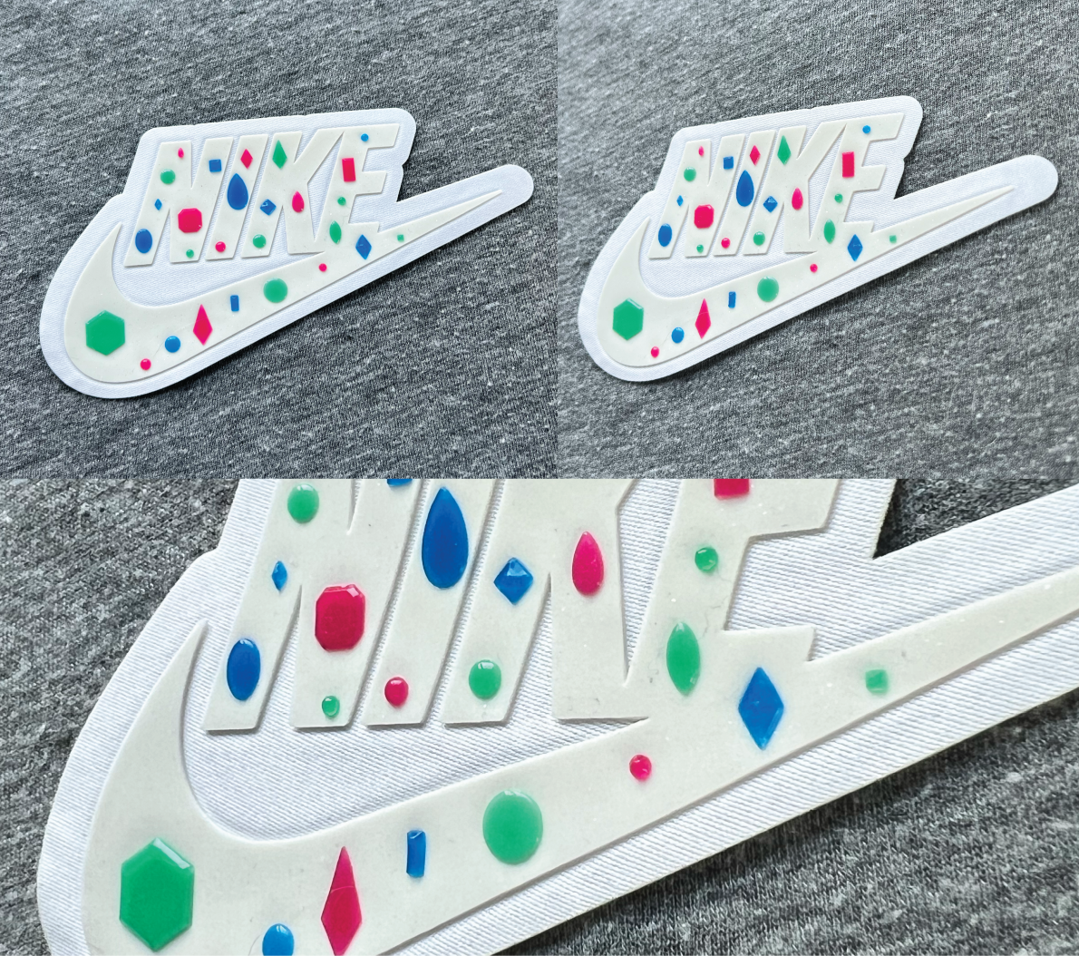
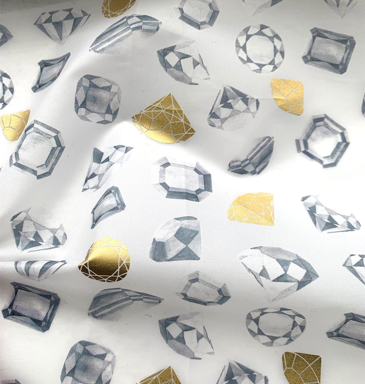
The inspiration for this last sample came from an unusual source—a trend in acrylic nail designs! ‘Treasure Chest’ nails included molded ‘gems’ on a clear glittery base.
While this sample did not quite arrive as I hoped it would, I was satisfied with the factory’s attempt at my unorthodox request. I would love to revisit this sample and try to push it to be closer to my original inspiration—clear and more glitter for the base, and maybe more moulding for the ‘gems’. Just most glitter, more sparkle, just POP it even more!
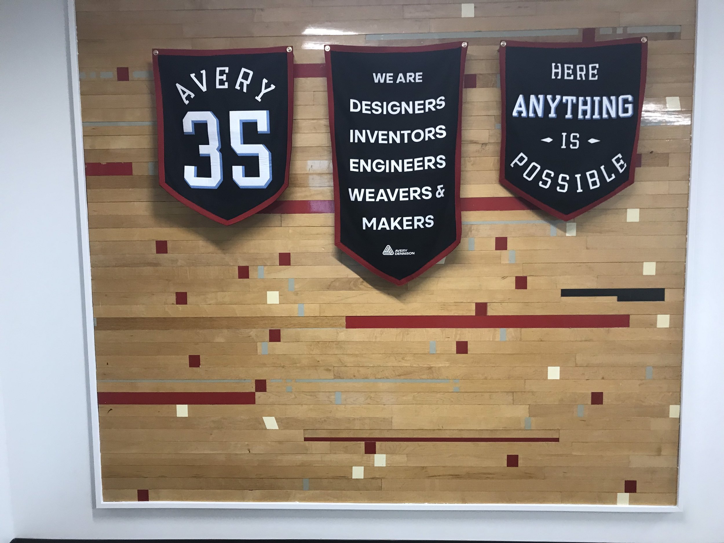
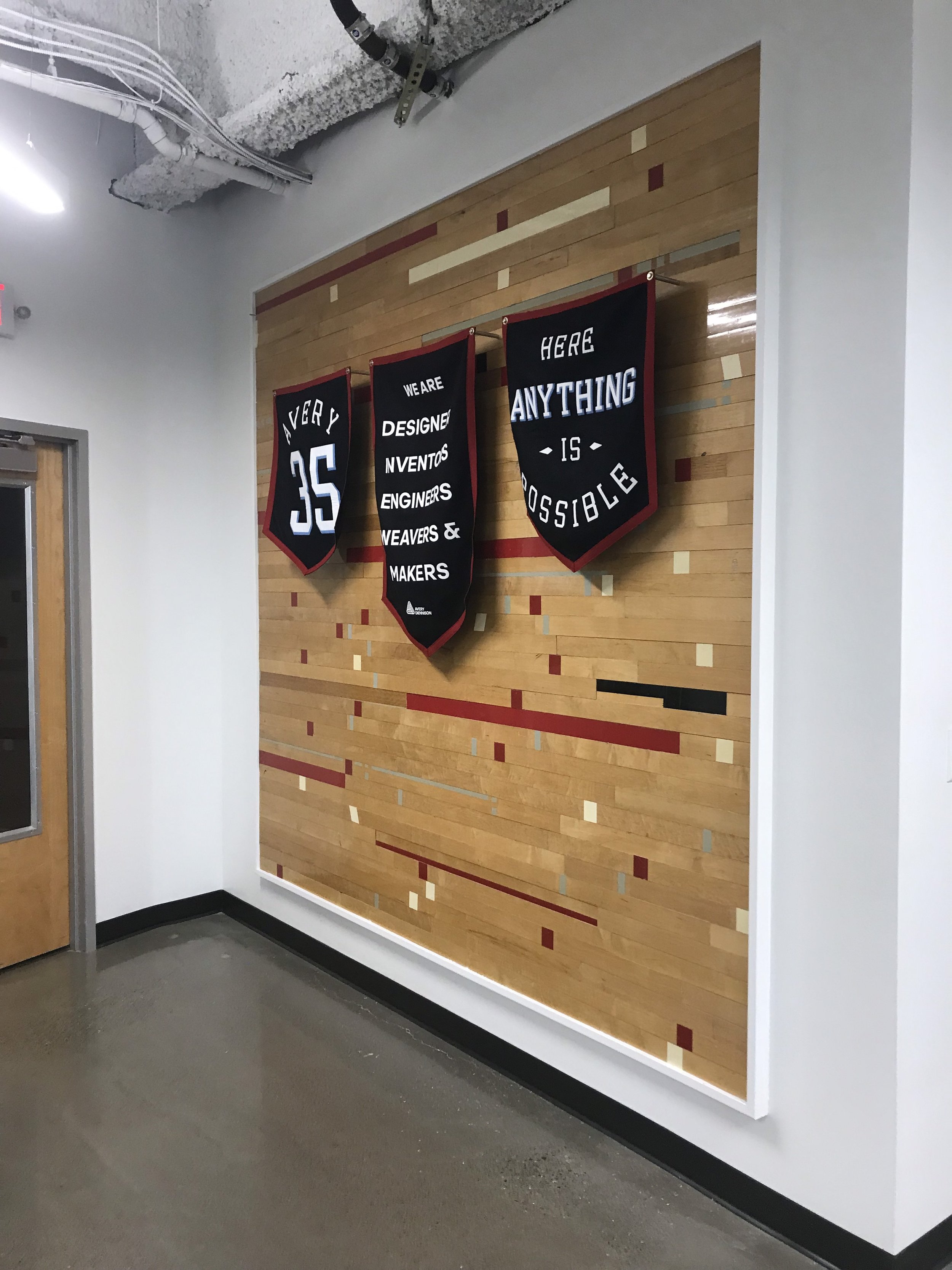
A unique part of my work at Avery Dennison included helping with the the design and graphics of the new office in Beaverton, OR. That included vinyl wall graphics, poster design, banners and even plant installations.
The first collection I worked on during my time with Nike Golf for Spring/Summer 2020.
The details here highlight the printing over jacquard technique used in this collection.
This short sleeve women’s shirt used the same printing on jacquard as the men’s style. In this case, instead of a texture, it’s a matte/shine effect.
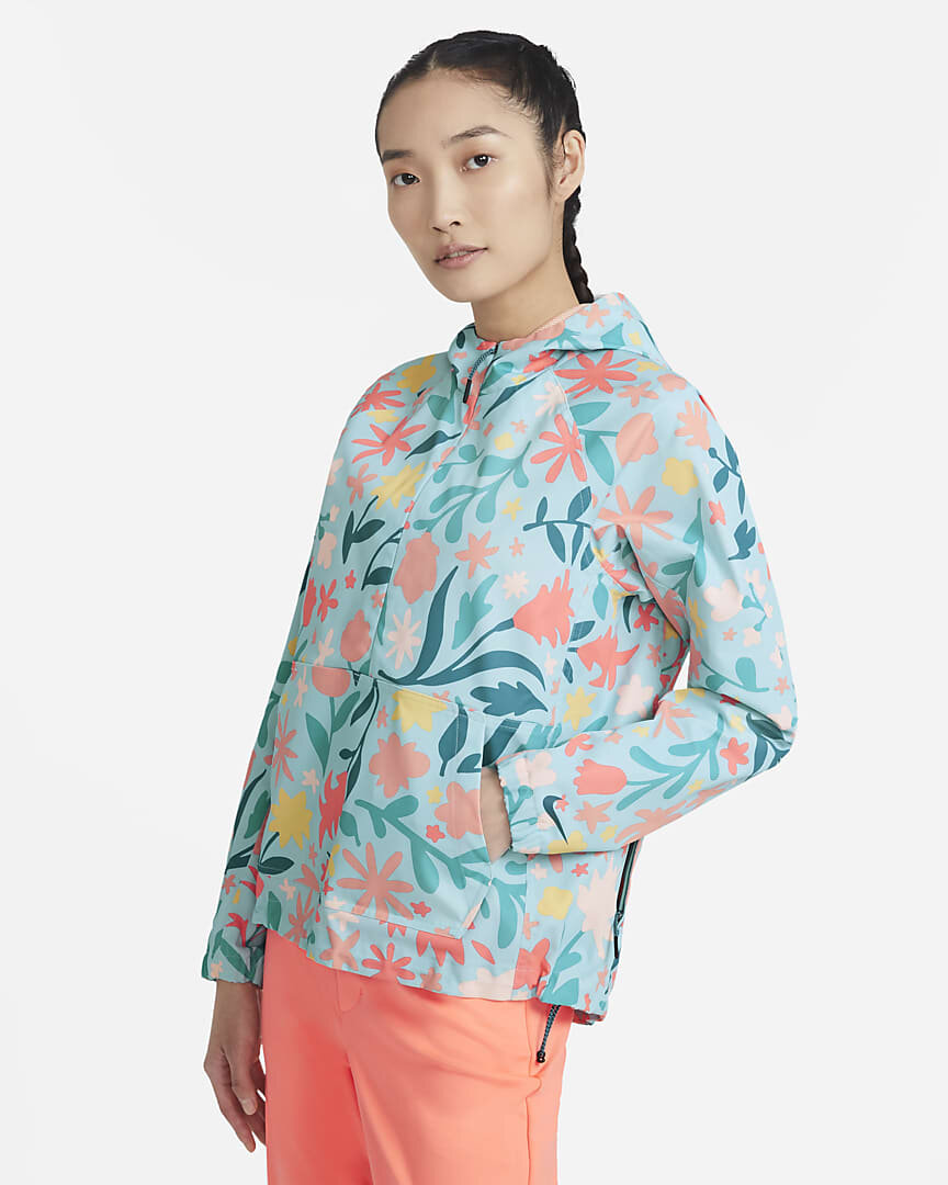
At the request of the color designer, I colored up this version of the floral print that was used for this Nike Polo and the seasonal anorak.
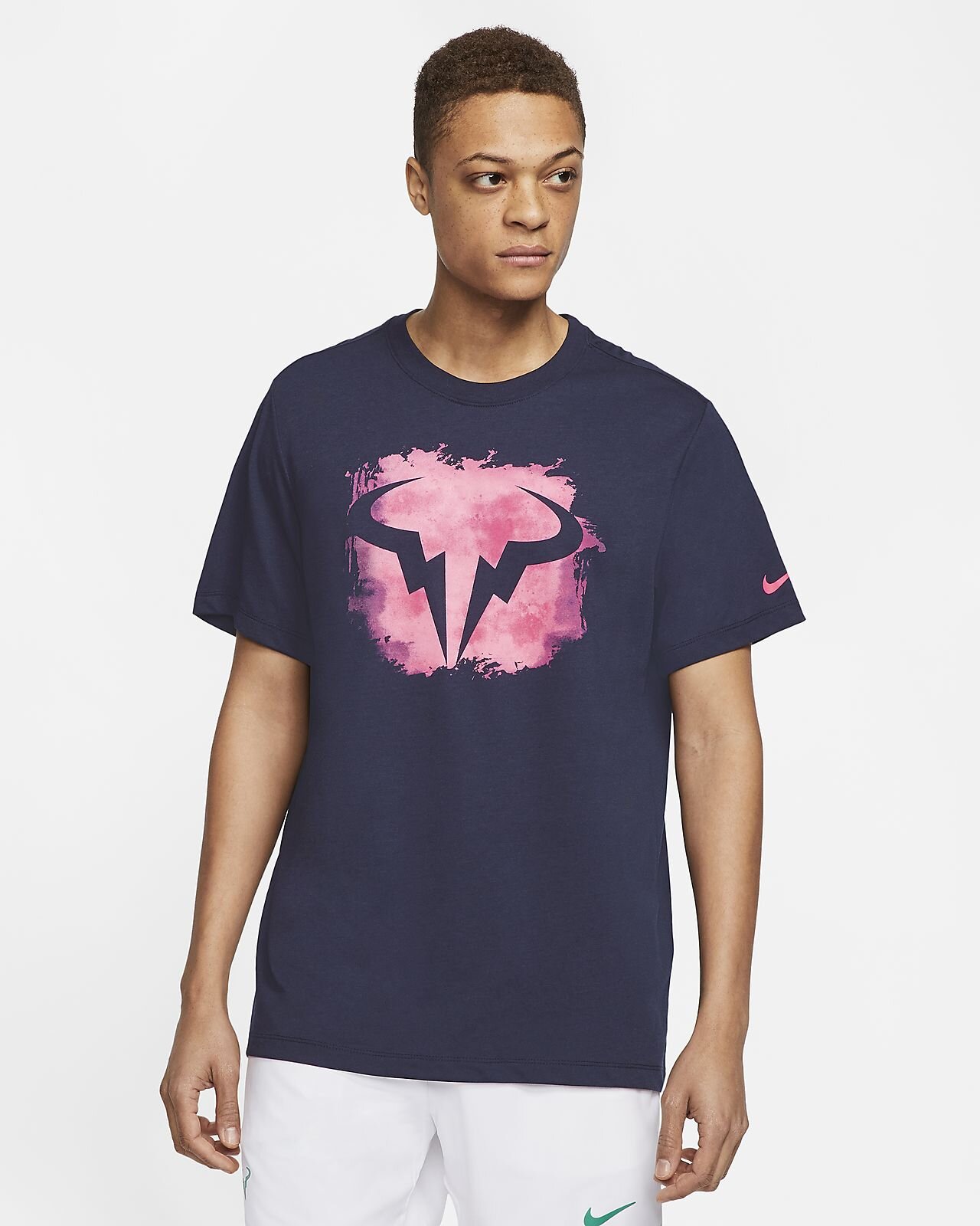
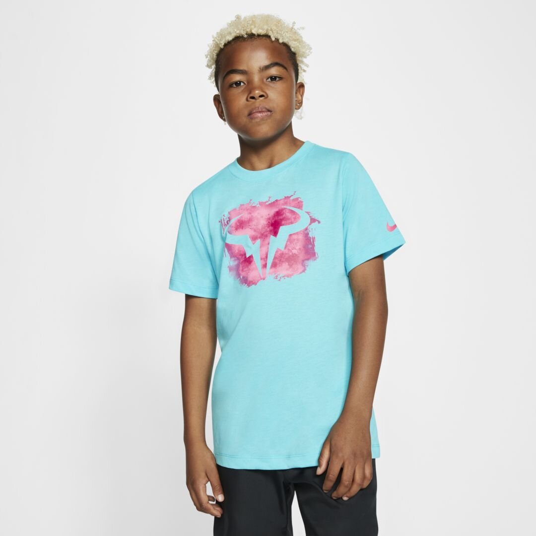
Patches included ones for SB Skate Day, a nod to Rory McIlroy’s golf-playing childhood, a custom Wimbeldon shoe for Tennis and a modified logo for LeBron.
One of my last patches created was a stylized speedboat à la Miami Vice for Super Bowl LIV that was played in Miami between the Buccaneers and the 49ers.
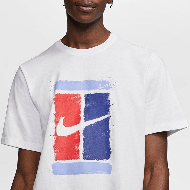
Inspiration was drawn from the iconic clay courts at Roland Garros and the couture fashion of Paris.
First passes included lots of movement and texture.
Some styles were also carried over into Kids.
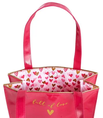
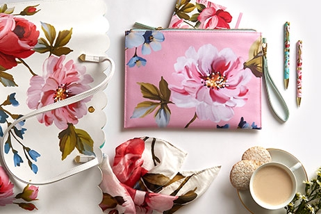
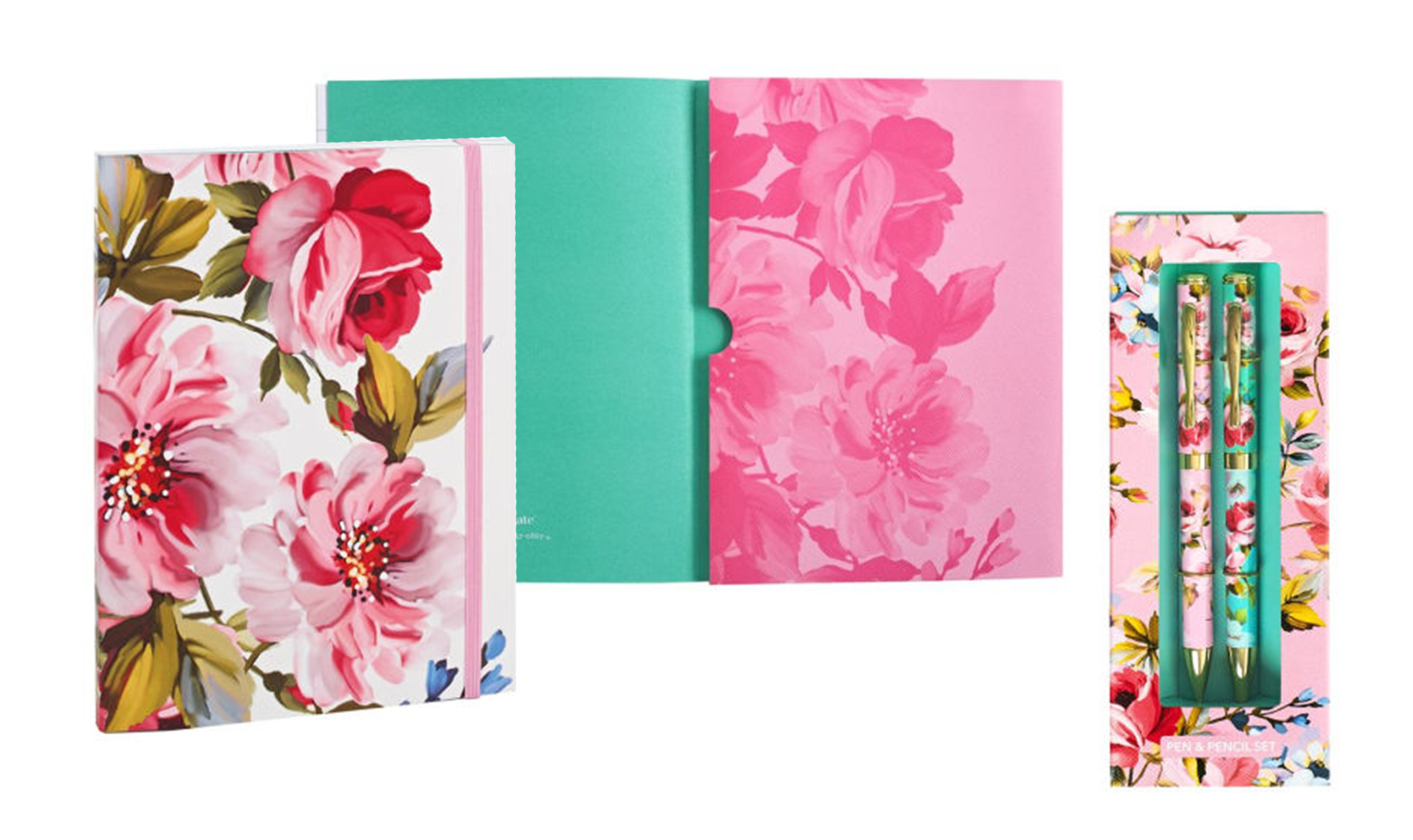
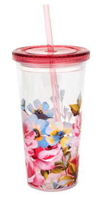
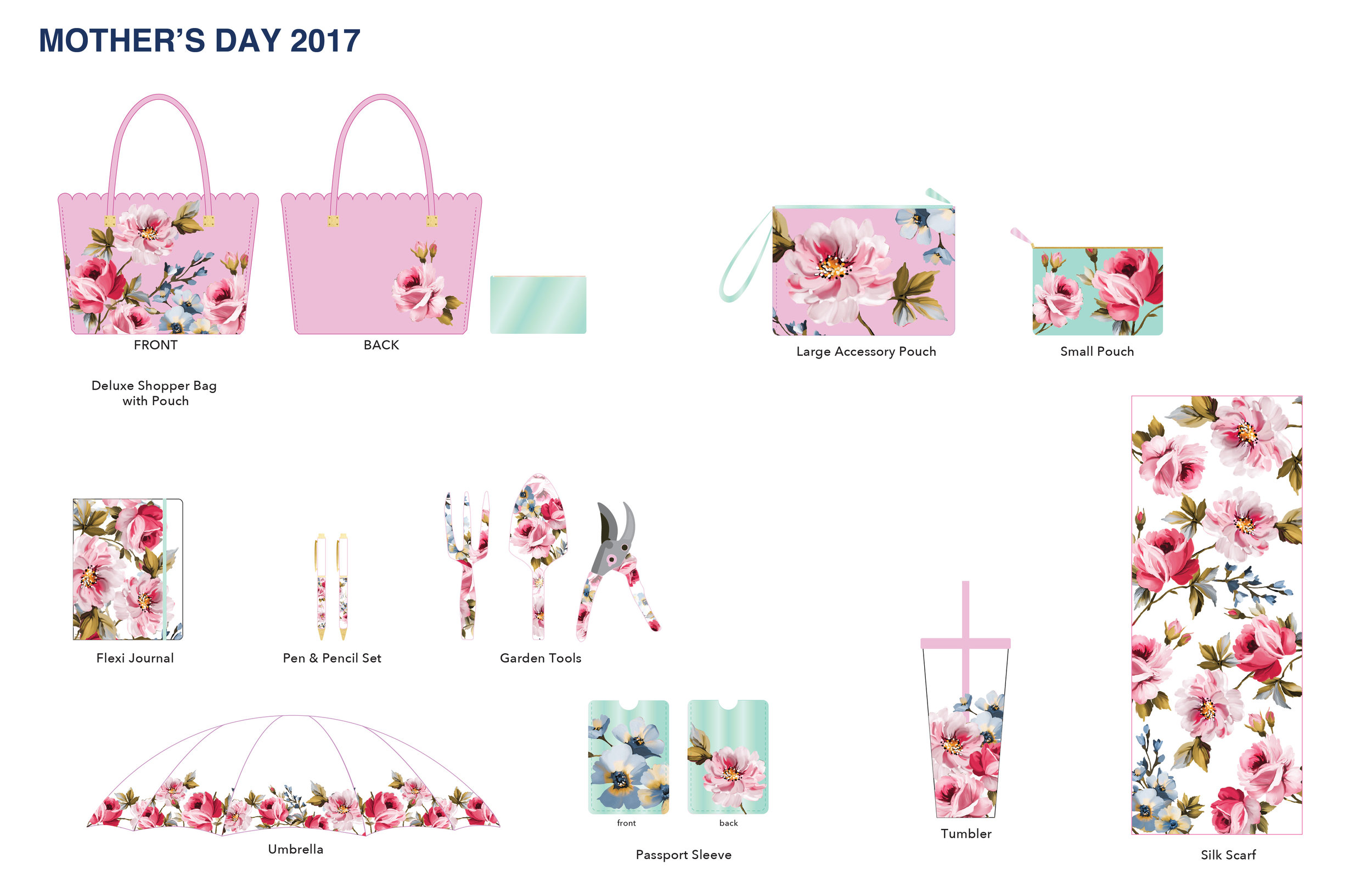
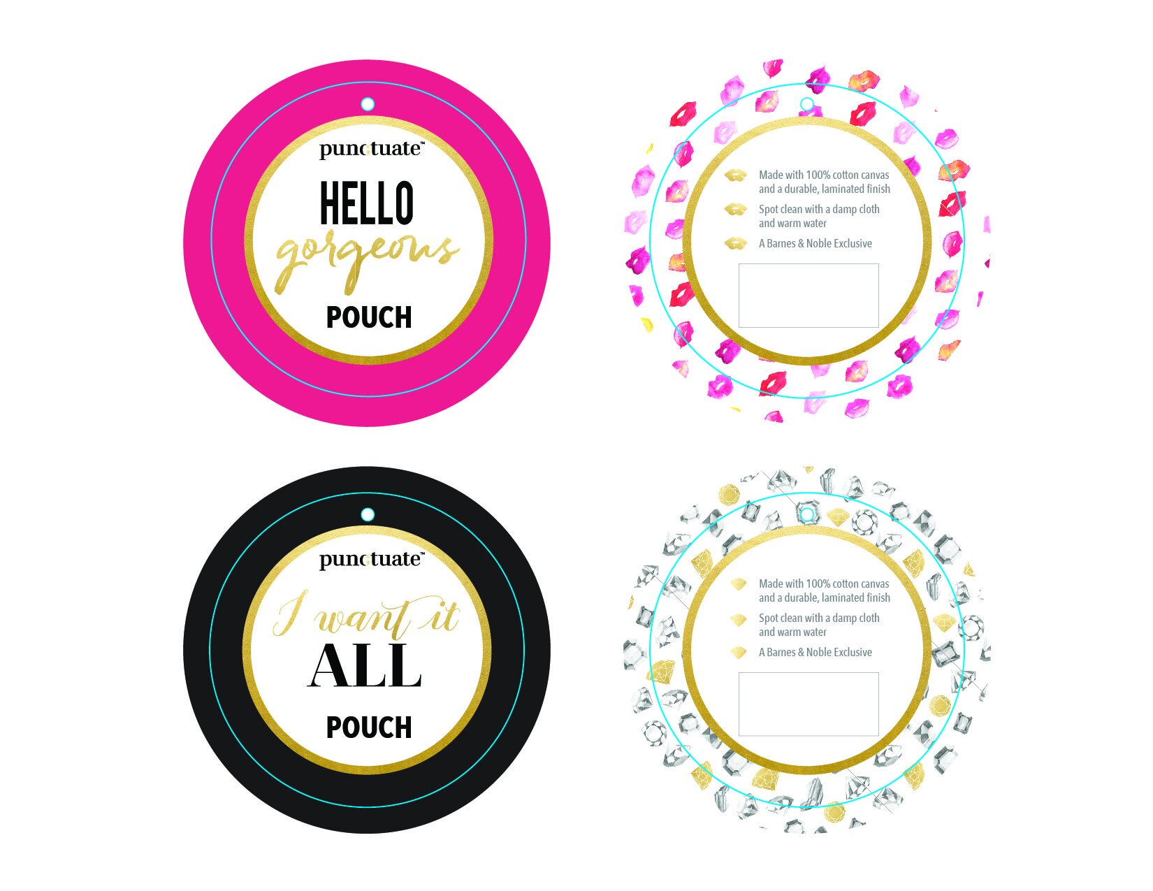
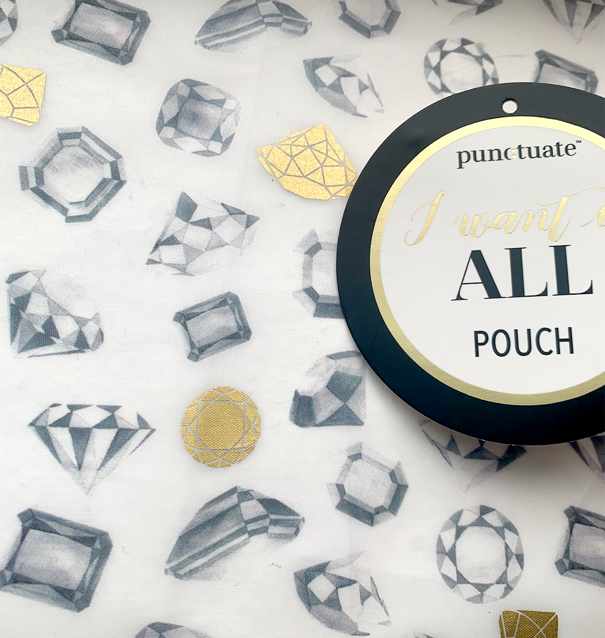
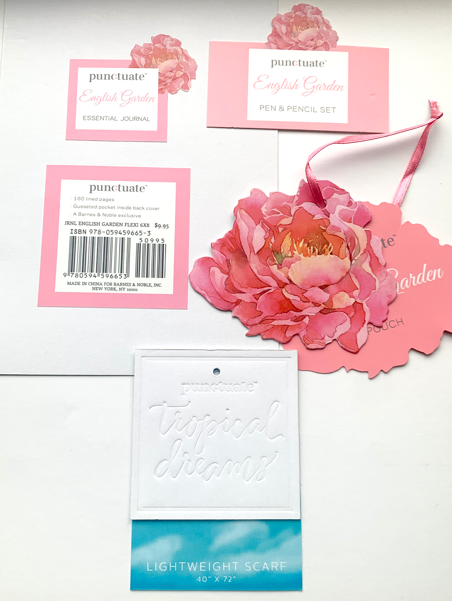
Designing for, and adapting graphics for Barnes & Noble’s proprietary gift line, punctuate.
A similar process was done for the lipstick allover print, though it kept its lipstick hues.
Finally, a small assortment of the various packaging options created, showing a wide range of techniques - spot varnish, die cutting, and embossing.
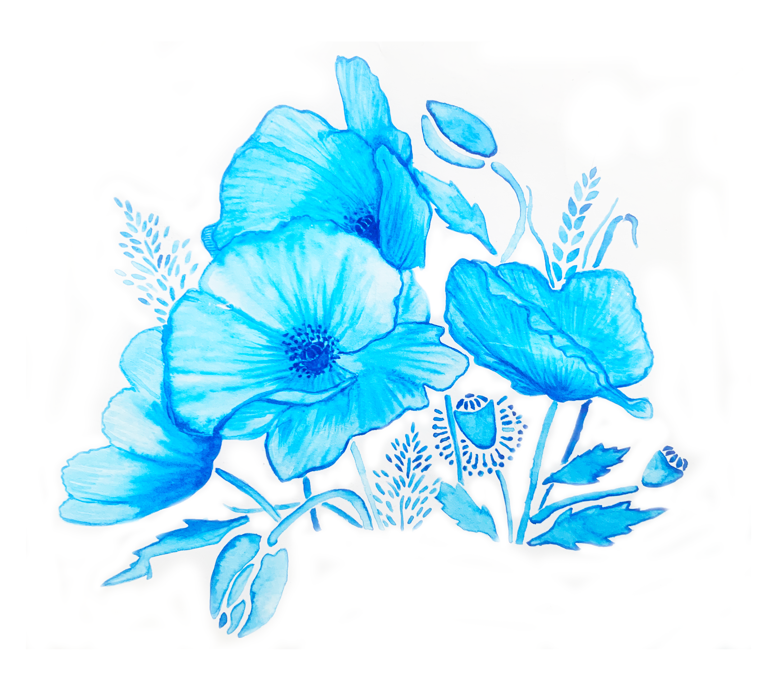
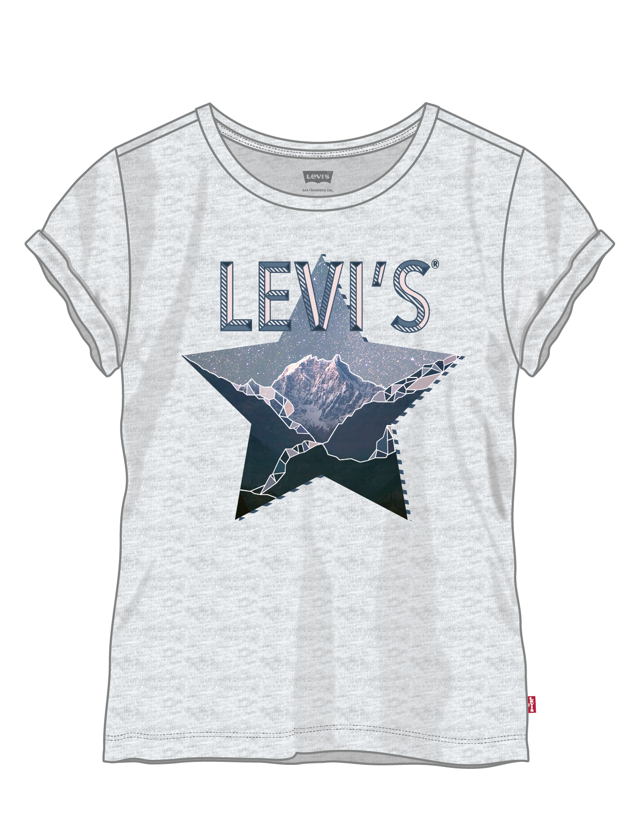
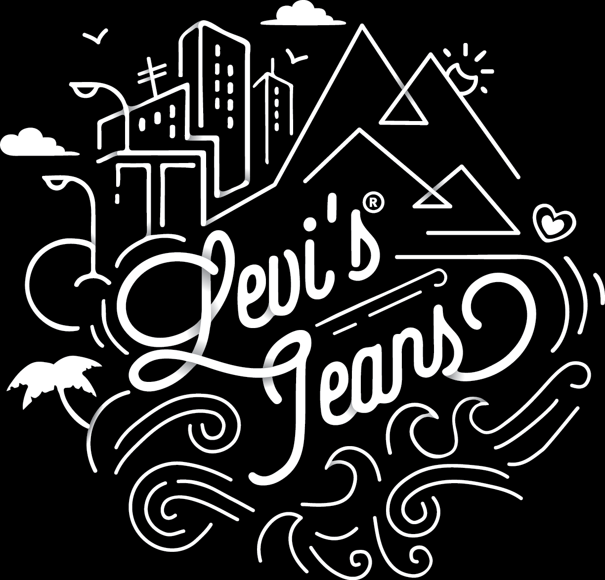
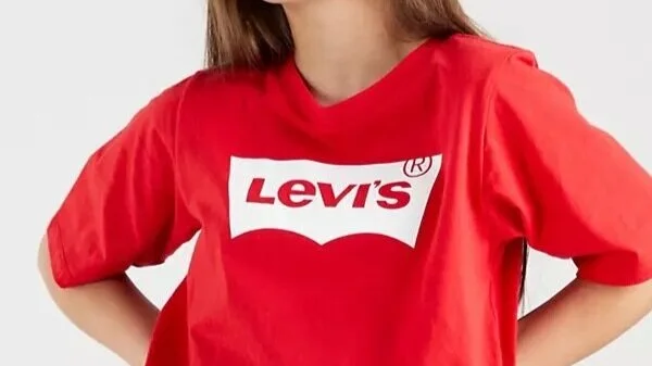
The girl’s line for classic Levi’s. A fun exploration of color, typography, and illustration through the seasons of Fall 2015-Fall 2016
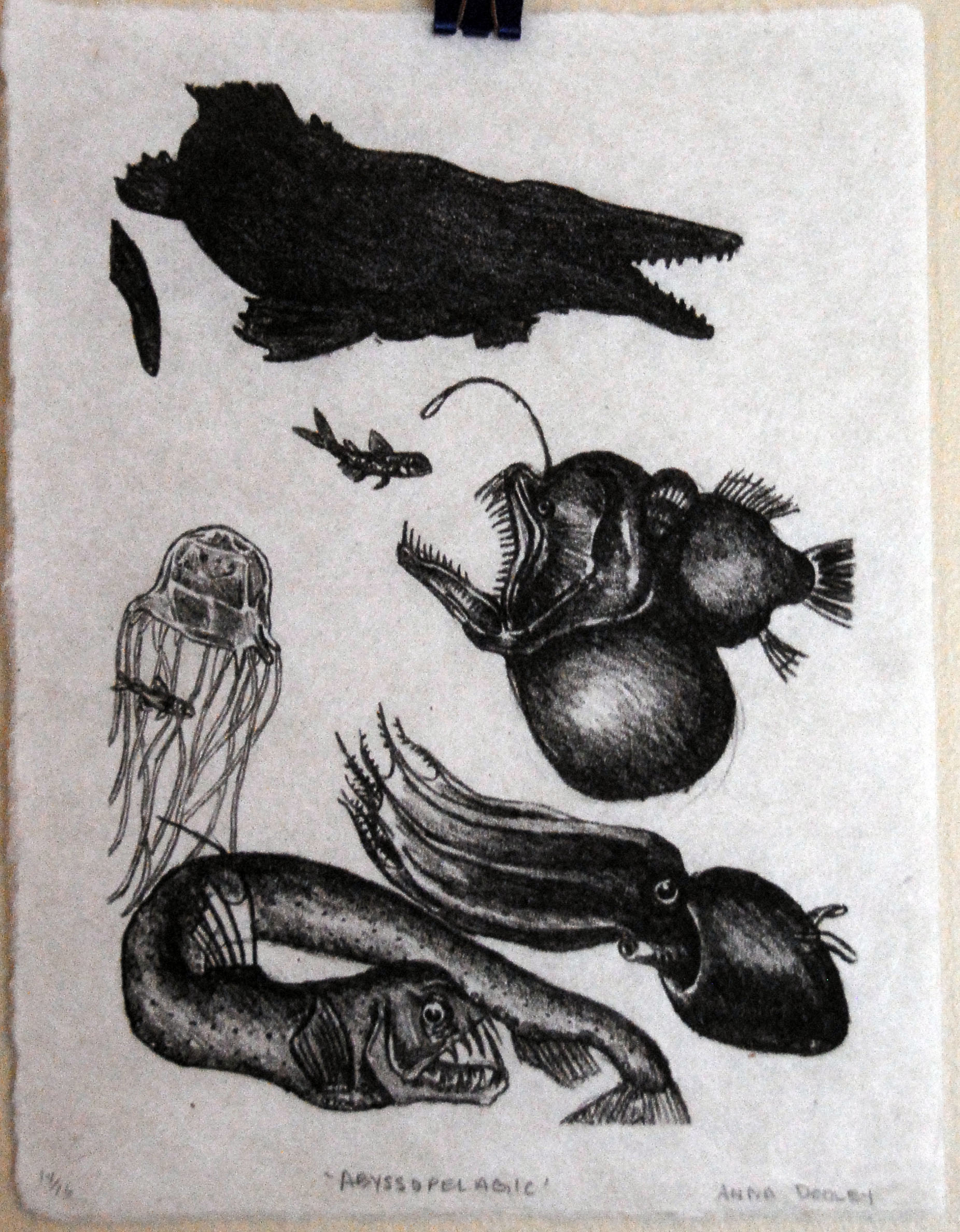
My own work; a combination of illustration, lithography, and paper cutting.
Butcher Birds, lithographic print + watercolor
Abyssopelagic, lithographic print
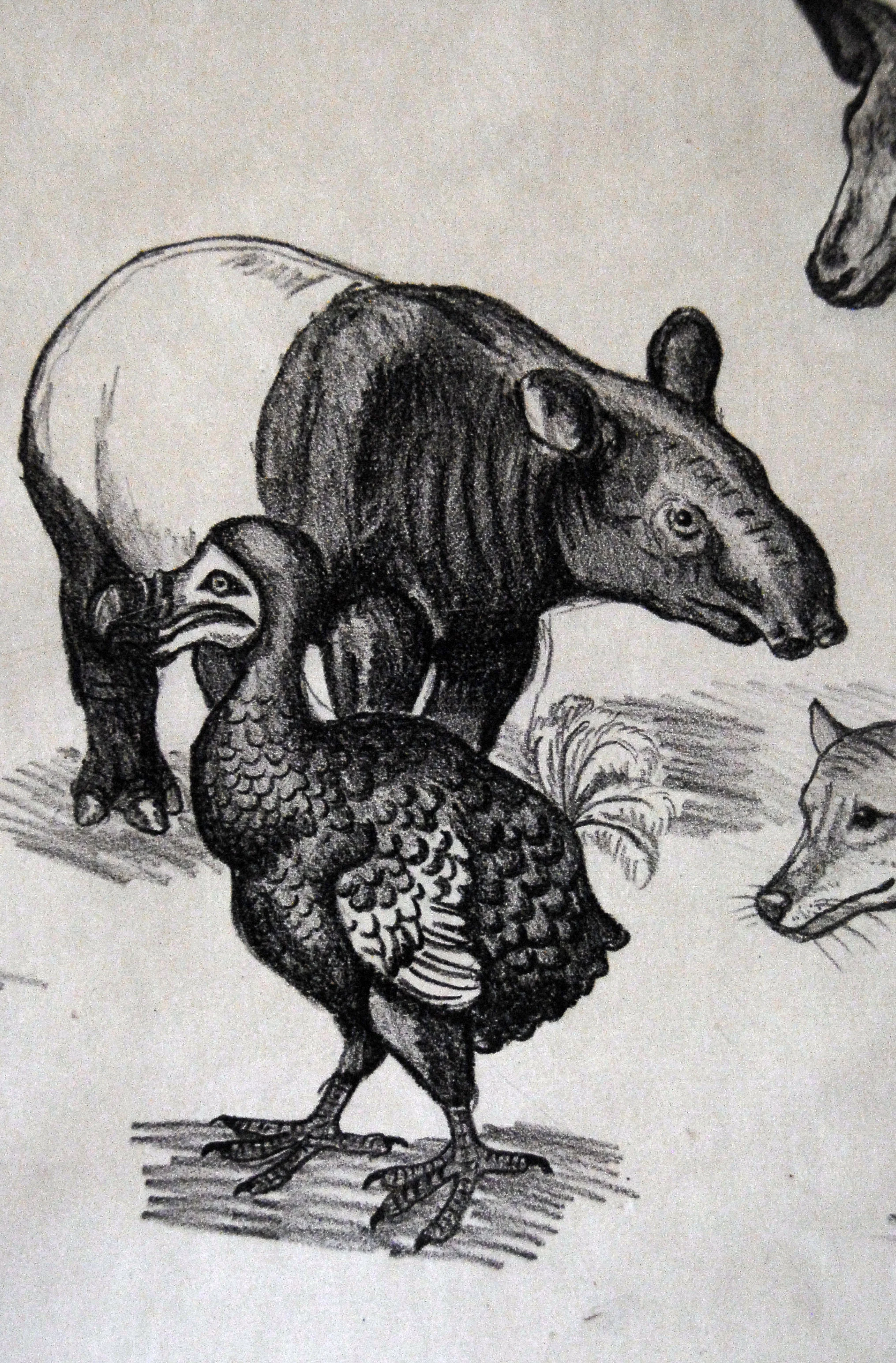
Modern Extinction, lithographic print
A gift for my family of our house for 20+ years that was just sold. This was made so that wherever they moved, they would have the house and its memories forever. It included our address, which has been blurred.
A gift for my sister of our childhood house, filled with the flowers that used to grow around it.